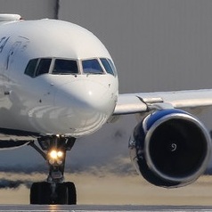
I gotta say the current UA livery should be one of the easiest (and long overdue) livery to improve. It's just so awful..
Can't wait until April to see it..
The one posted by InnsbruckFlyer is a major improvement, I must say..
Regards
B8887
Moderators: richierich, ua900, PanAm_DC10, hOMSaR
Re: United Airlines "Evolution" to Globe Livery coming in April
The globe livery is out of date and does not make me think of United Airlines. United used to have great brand awareness, positive or negative. The globe does not make me think of United at all. The globe did well with PanAm. Hopefully United will introduce a new logo and branding to improve its image. It did not make sense to keep the name United and use the CO globe as its logo.
Re: United Airlines "Evolution" to Globe Livery coming in April
Pi7472000 wrote:The globe livery is out of date and does not make me think of United Airlines. United used to have great brand awareness, positive or negative. The globe does not make me think of United at all. The globe did well with PanAm. Hopefully United will introduce a new logo and branding to improve its image. It did not make sense to keep the name United and use the CO globe as its logo.
You are going to be sorely disappointed because the globe is not going away.

Re: United Airlines "Evolution" to Globe Livery coming in April
For those of us who have followed the airline industry in the long term, yes, the livery is a mixture of United and Continental. But it's been nine years since the merger and I would say that, to the general public, by this time, it is the United globe.
-

- antoniemey
- Posts: 1419
- Joined:
Re: United Airlines "Evolution" to Globe Livery coming in April
Pi7472000 wrote:The globe livery is out of date and does not make me think of United Airlines. United used to have great brand awareness, positive or negative. The globe does not make me think of United at all. The globe did well with PanAm. Hopefully United will introduce a new logo and branding to improve its image. It did not make sense to keep the name United and use the CO globe as its logo.
It made huge sense from a cost standpoint: with 1400 planes in the combined fleet, 700 of them would only need the titles re-applied. At the time, CO also still, whether rightfully or not, still benefited from a better reputation among a lot of regular travelers. Keeping the CO branding told them that this new airline would try to meet the standard they were used to. Did it work? Maybe not. Could something flashy, fancy, and pretty have been done instead? Yes, but flashy, fancy, and pretty was not the aim. Consistency was. United had none and it desperately needed it.
It was a sound choice in several metrics. Right choice? Well, maybe, maybe not. Only time will tell.
Re: United Airlines "Evolution" to Globe Livery coming in April
I used to think “Continental” when I saw the globe, although I think now it makes sense to keep the globe considering United’s huge span of... “worldwide service”.
Blue should be the dominant color of the livery.
Blue should be the dominant color of the livery.
Re: United Airlines "Evolution" to Globe Livery coming in April
B8887 wrote:I gotta say the current UA livery should be one of the easiest (and long overdue) livery to improve. It's just so awful..
Can't wait until April to see it..
The one posted by InnsbruckFlyer is a major improvement, I must say..
Regards
B8887
That isn’t the new livery.
Re: United Airlines "Evolution" to Globe Livery coming in April
FSDan wrote:jetKIWI wrote:Could the Blue-on-Blue IFE/United Polaris signage be a subtle hint?
That's a good thought. The article mentions the likelihood of less gold and the incorporation of some of the other colors UA has added to their branding palette.


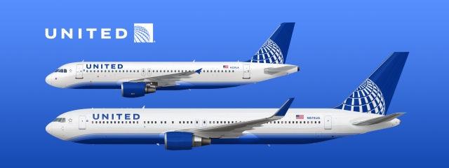
I think the updated globe on the tail will be in shades of blue, like these, not blue and white.

Re: United Airlines "Evolution" to Globe Livery coming in April
InnsbruckFlyer wrote:Doubt it’s the real one, but I personally like this one:
It’s smart and has hints of the Blue livery.
Looks good, but it looks more like something that was thought of in 2010. That's the PMUA bottom half with a PMCO top half.
Re: United Airlines "Evolution" to Globe Livery coming in April
questions wrote:FSDan wrote:jetKIWI wrote:Could the Blue-on-Blue IFE/United Polaris signage be a subtle hint?
That's a good thought. The article mentions the likelihood of less gold and the incorporation of some of the other colors UA has added to their branding palette.
I think the updated globe on the tail will be in shades of blue, like these, not blue and white.
agreed - that's a good look for the globe on the tail. blue-on-blue and positioned on the tail the same way on that AVOD screen, or perhaps vertically on the tail. white fuselage, gray bottom, and UNITED in block letters, but what color, i don't know. chance to get it right!
Re: United Airlines "Evolution" to Globe Livery coming in April
I did not imply that.. I just said it looks good.. No big deal anyway.
Maybe they are in touch with the same graphic designer/ agency as their Star partners LH..
"Hey, are you dropping the yellow/golden colour too"?
Regards.
B8887
Maybe they are in touch with the same graphic designer/ agency as their Star partners LH..
"Hey, are you dropping the yellow/golden colour too"?
Regards.
B8887
Re: United Airlines "Evolution" to Globe Livery coming in April
seat1a wrote:questions wrote:FSDan wrote:
That's a good thought. The article mentions the likelihood of less gold and the incorporation of some of the other colors UA has added to their branding palette.
I think the updated globe on the tail will be in shades of blue, like these, not blue and white.
agreed - that's a good look for the globe on the tail. blue-on-blue and positioned on the tail the same way on that AVOD screen, or perhaps vertically on the tail. white fuselage, gray bottom, and UNITED in block letters, but what color, i don't know. chance to get it right!
The second one, on the wall in the Polaris cabin, would look sharp on the tail especially if it was painted to give it depth.
Re: United Airlines "Evolution" to Globe Livery coming in April
KLMatSJC wrote:InnsbruckFlyer wrote:Doubt it’s the real one, but I personally like this one:
It’s smart and has hints of the Blue livery.
Looks good, but it looks more like something that was thought of in 2010. That's the PMUA bottom half with a PMCO top half.
That’s not an evolution. It’s a step back. Why take two old liveries and try to mesh them. That mistake was already made.
-
- Continental767
- Posts: 227
- Joined:
Re: United Airlines "Evolution" to Globe Livery coming in April
antoniemey wrote:Pi7472000 wrote:The globe livery is out of date and does not make me think of United Airlines. United used to have great brand awareness, positive or negative. The globe does not make me think of United at all. The globe did well with PanAm. Hopefully United will introduce a new logo and branding to improve its image. It did not make sense to keep the name United and use the CO globe as its logo.
It made huge sense from a cost standpoint: with 1400 planes in the combined fleet, 700 of them would only need the titles re-applied. At the time, CO also still, whether rightfully or not, still benefited from a better reputation among a lot of regular travelers. Keeping the CO branding told them that this new airline would try to meet the standard they were used to. Did it work? Maybe not. Could something flashy, fancy, and pretty have been done instead? Yes, but flashy, fancy, and pretty was not the aim. Consistency was. United had none and it desperately needed it.
It was a sound choice in several metrics. Right choice? Well, maybe, maybe not. Only time will tell.
+1 to this.
United still had planes in the Battleship livery when they merged with CO. Introducing a fully new livery would result in three different liveries of varying names and logos flying around. It would take a good amount of time to paint 1400 aircraft, so what they did made total sense. They took a livery that was recognized and respected, plus was already on half the fleet.
On the topic of a refreshed livery, I agree that purple will likely be part of it. I can see a tail with the "globe edge" shown above as a pattern in a dark purple with blue behind, and maybe a white globe on top? Just a quick thought, but I think it'd be nice. Something along those lines. No way they are getting rid of the globe now; many people are just now associating it with United and not Continental.
Re: United Airlines "Evolution" to Globe Livery coming in April
questions wrote:seat1a wrote:questions wrote:
I think the updated globe on the tail will be in shades of blue, like these, not blue and white.
agreed - that's a good look for the globe on the tail. blue-on-blue and positioned on the tail the same way on that AVOD screen, or perhaps vertically on the tail. white fuselage, gray bottom, and UNITED in block letters, but what color, i don't know. chance to get it right!
The second one, on the wall in the Polaris cabin, would look sharp on the tail especially if it was painted to give it depth.
yup! it's a good look. aligns with their 'evolution' thinking, may spare them a complete brand re-do. get the font correct on the fuselage. no gold waves, either. i'm thinking simple and elegant like that austrian airlines retro livery posted last week. terrific!
Re: United Airlines "Evolution" to Globe Livery coming in April
B737900ER wrote:KLMatSJC wrote:InnsbruckFlyer wrote:Doubt it’s the real one, but I personally like this one:
It’s smart and has hints of the Blue livery.
Looks good, but it looks more like something that was thought of in 2010. That's the PMUA bottom half with a PMCO top half.
That’s not an evolution. It’s a step back. Why take two old liveries and try to mesh them. That mistake was already made.
That actually doesn't look half bad but the winglets and bottom are way too similar to Delta. That could've been a nice midterm livery in the last few years though.
However if they updated the globe (even more than that mock photo, not just change the color of it) and use the "Tulip" as a secret logo as mentioned, I'd be more than OK with that. Something tells me there will be more purple and light green based on the uniforms.

Re: United Airlines "Evolution" to Globe Livery coming in April
InnsbruckFlyer wrote:Doubt it’s the real one, but I personally like this one:
It’s smart and has hints of the Blue livery.
Jetblue, and Delta would sue for plagiarism........
Re: United Airlines "Evolution" to Globe Livery coming in April
One of the most interesting liveries that was NWA before the Delta merger. It was simple yet sophisticated with the red tail. With better metallic paint that doesn't fade after six months of high altitude UV rays, it would be a good time for UA to adapt a simple yet contemporary design with the globe on the tail. It would stand out at the world's airports filled with Eurowhites and and blue bottoms liveries.
Re: United Airlines "Evolution" to Globe Livery coming in April
Continental767 wrote:antoniemey wrote:Pi7472000 wrote:The globe livery is out of date and does not make me think of United Airlines. United used to have great brand awareness, positive or negative. The globe does not make me think of United at all. The globe did well with PanAm. Hopefully United will introduce a new logo and branding to improve its image. It did not make sense to keep the name United and use the CO globe as its logo.
It made huge sense from a cost standpoint: with 1400 planes in the combined fleet, 700 of them would only need the titles re-applied. At the time, CO also still, whether rightfully or not, still benefited from a better reputation among a lot of regular travelers. Keeping the CO branding told them that this new airline would try to meet the standard they were used to. Did it work? Maybe not. Could something flashy, fancy, and pretty have been done instead? Yes, but flashy, fancy, and pretty was not the aim. Consistency was. United had none and it desperately needed it.
It was a sound choice in several metrics. Right choice? Well, maybe, maybe not. Only time will tell.
+1 to this.
United still had planes in the Battleship livery when they merged with CO. Introducing a fully new livery would result in three different liveries of varying names and logos flying around. It would take a good amount of time to paint 1400 aircraft, so what they did made total sense. They took a livery that was recognized and respected, plus was already on half the fleet.
On the topic of a refreshed livery, I agree that purple will likely be part of it. I can see a tail with the "globe edge" shown above as a pattern in a dark purple with blue behind, and maybe a white globe on top? Just a quick thought, but I think it'd be nice. Something along those lines. No way they are getting rid of the globe now; many people are just now associating it with United and not Continental.
No that clearly wasn't the messaging. "Jailbird Jeff Smisek" wanted to keep the livery out of sheer ego and stubbornness. Remember the comment "Well I'd like to keep the logo because I made it!" comment? Which, of course he probably didn't but he was an absolute egotist and many of the decisions he made still haunt the airline today. Mainly because they bet the farm on his decisions and lost to DL in the long run. UAL had 60% of it's mainline fleet at the time painted and on larger planes. It essentially was a wash, but it was done out of ego alone and nothing else.
I was actually really upset after merger that they went with a livery that was almost 25 years old at the time. UAL's "Rising Blue" scheme was absolutely beautiful compared to any of the other major carriers at the time and even looks great now. CO's scheme was good for CO (already post date by 2010, IMHO) but was ridiculous as a monumental merger between the two airlines.
Say what people will about the battleship scheme too, it looked terrible when chipped but amazing when it was clean. And don't kid yourself, CO's paint had some examples of chipping by 2010 as well on the tail and logo.
Nowadays I'm OK with them moving on with the globe as long as it's a *TRANSFORMATIVE* different example and not just a color change from the CO logo. This is a long time coming, and it's not shocking to see this airline with it's "Chicago Style" cronyism drag it's feet to make decisions very slowly.
-

- khinstorff
- Posts: 104
- Joined:
Re: United Airlines "Evolution" to Globe Livery coming in April
william wrote:One of the most interesting liveries that was NWA before the Delta merger. It was simple yet sophisticated with the red tail. With better metallic paint that doesn't fade after six months of high altitude UV rays, it would be a good time for UA to adapt a simple yet contemporary design with the globe on the tail. It would stand out at the world's airports filled with Eurowhites and and blue bottoms liveries.
You’re 100% right about the NWA livery. It was almost ahead of its time looking back at the direction AA decided to go in. However, I loved this NW livery even more, especially seeing it on the 757’s into MSN & MKE!
https://goo.gl/images/KqhZNf
Re: United Airlines "Evolution" to Globe Livery coming in April
khinstorff wrote:william wrote:One of the most interesting liveries that was NWA before the Delta merger. It was simple yet sophisticated with the red tail. With better metallic paint that doesn't fade after six months of high altitude UV rays, it would be a good time for UA to adapt a simple yet contemporary design with the globe on the tail. It would stand out at the world's airports filled with Eurowhites and and blue bottoms liveries.
You’re 100% right about the NWA livery. It was almost ahead of its time looking back at the direction AA decided to go in. However, I loved this NW livery even more, especially seeing it on the 757’s into MSN & MKE!
https://goo.gl/images/KqhZNf
AA’s livery would look so much better if they had used a metallic silver gray similar the NW’s be the flat gray they chose.
https://www.airplane-pictures.net/photo/265176/n547us-northwest-airlines-boeing-757-200/
The NW livery looked good. Too bad that’s all there was to the airline.
Last edited by questions on Tue Mar 12, 2019 7:41 am, edited 1 time in total.
Re: United Airlines "Evolution" to Globe Livery coming in April
N649DL wrote:"Jailbird Jeff Smisek"... many of the decisions he made still haunt the airline today. Mainly because they bet the farm on his decisions and lost to DL in the long run.
What are some examples of his decisions that are still haunting UA today? Just curious. Thanks.
Re: United Airlines "Evolution" to Globe Livery coming in April
N649DL wrote:B737900ER wrote:KLMatSJC wrote:
Looks good, but it looks more like something that was thought of in 2010. That's the PMUA bottom half with a PMCO top half.
That’s not an evolution. It’s a step back. Why take two old liveries and try to mesh them. That mistake was already made.
That actually doesn't look half bad but the winglets and bottom are way too similar to Delta. That could've been a nice midterm livery in the last few years though.
However if they updated the globe (even more than that mock photo, not just change the color of it) and use the "Tulip" as a secret logo as mentioned, I'd be more than OK with that. Something tells me there will be more purple and light green based on the uniforms.
I think it is a nice clean look. Maybe add some silver to it.
Re: United Airlines "Evolution" to Globe Livery coming in April
N649DL wrote:Continental767 wrote:antoniemey wrote:
It made huge sense from a cost standpoint: with 1400 planes in the combined fleet, 700 of them would only need the titles re-applied. At the time, CO also still, whether rightfully or not, still benefited from a better reputation among a lot of regular travelers. Keeping the CO branding told them that this new airline would try to meet the standard they were used to. Did it work? Maybe not. Could something flashy, fancy, and pretty have been done instead? Yes, but flashy, fancy, and pretty was not the aim. Consistency was. United had none and it desperately needed it.
It was a sound choice in several metrics. Right choice? Well, maybe, maybe not. Only time will tell.
+1 to this.
United still had planes in the Battleship livery when they merged with CO. Introducing a fully new livery would result in three different liveries of varying names and logos flying around. It would take a good amount of time to paint 1400 aircraft, so what they did made total sense. They took a livery that was recognized and respected, plus was already on half the fleet.
On the topic of a refreshed livery, I agree that purple will likely be part of it. I can see a tail with the "globe edge" shown above as a pattern in a dark purple with blue behind, and maybe a white globe on top? Just a quick thought, but I think it'd be nice. Something along those lines. No way they are getting rid of the globe now; many people are just now associating it with United and not Continental.
No that clearly wasn't the messaging. "Jailbird Jeff Smisek" wanted to keep the livery out of sheer ego and stubbornness. Remember the comment "Well I'd like to keep the logo because I made it!" comment? Which, of course he probably didn't but he was an absolute egotist and many of the decisions he made still haunt the airline today. Mainly because they bet the farm on his decisions and lost to DL in the long run. UAL had 60% of it's mainline fleet at the time painted and on larger planes. It essentially was a wash, but it was done out of ego alone and nothing else.
I was actually really upset after merger that they went with a livery that was almost 25 years old at the time. UAL's "Rising Blue" scheme was absolutely beautiful compared to any of the other major carriers at the time and even looks great now. CO's scheme was good for CO (already post date by 2010, IMHO) but was ridiculous as a monumental merger between the two airlines.
Say what people will about the battleship schemie too, it looked terrible when chipped but amazing when it was clean. And don't kid yourself, CO's paint had some examples of chipping by 2010 as well on the tail and logo.
Nowadays I'm OK with them moving on with the globe as long as it's a *TRANSFORMATIVE* different example and not just a color change from the CO logo. This is a long time coming, and it's not shocking to see this airline with it's "Chicago Style" cronyism drag it's feet to make decisions very slowly.
I respect all of your opinion on this. But I have to take issue with this statement.
“And don't kid yourself, CO's paint had some examples of chipping by 2010 as well on the tail and logo.”
CO kept its fleet perfect inside and out before the merger. None of the chipping outside or faded worn cabins we see now.
If there a single chipped CO livery pic out there, there is a thousand battleship grays for it.
CO actually had a toll free hotline number for any employee to call in from the aircrafts in seat phones if they saw an issue. Can you imagine how many thousands of phone call such a program would generate today??
Re: United Airlines "Evolution" to Globe Livery coming in April
questions wrote:N649DL wrote:"Jailbird Jeff Smisek"... many of the decisions he made still haunt the airline today. Mainly because they bet the farm on his decisions and lost to DL in the long run.
What are some examples of his decisions that are still haunting UA today? Just curious. Thanks.
Please, for the love of God, no. We don't need to go there again, and again, and again. That's like catnip for certain posters who may or may not have been banned multiple times under different usernames, who may or may not be posting in this forum again, on this very thread.
Let's just stick to the topic...
Re: United Airlines "Evolution" to Globe Livery coming in April
khinstorff wrote:william wrote:One of the most interesting liveries that was NWA before the Delta merger. It was simple yet sophisticated with the red tail. With better metallic paint that doesn't fade after six months of high altitude UV rays, it would be a good time for UA to adapt a simple yet contemporary design with the globe on the tail. It would stand out at the world's airports filled with Eurowhites and and blue bottoms liveries.
You’re 100% right about the NWA livery. It was almost ahead of its time looking back at the direction AA decided to go in. However, I loved this NW livery even more, especially seeing it on the 757’s into MSN & MKE!
https://goo.gl/images/KqhZNf
Yes, and what I think was best with this livery was that logo! I thought it was brilliant that it combined both the compass arrow pointing northwest, but it also had an N which also was a W at the same time! I was very sad when that was replaced with just the compass arrow in the circle.

Re: United Airlines "Evolution" to Globe Livery coming in April


Several attempts done by myself. Leaning towards the second of the set, think it needs a bit of blue somewhere, but not sure where to put it (the third one was an attempt to do just that). Was a fun experiment!

Re: United Airlines "Evolution" to Globe Livery coming in April
I really wish at least one US carrier besides NK would dump the color blue completely from their color scheme (even F9 has it in their uniforms/computerized screens). I love the (very) old CO scheme of gold and black; it looked so clean and crisp. UA would need to update the font, but a simple variation on that classic CO scheme would look wonderful.
Re: United Airlines "Evolution" to Globe Livery coming in April
javier787 wrote:
Several attempts done by myself. Leaning towards the second of the set, think it needs a bit of blue somewhere, but not sure where to put it (the third one was an attempt to do just that). Was a fun experiment!
Awesome!
Only upgrade would be less space between letters.
Re: United Airlines "Evolution" to Globe Livery coming in April
questions wrote:javier787 wrote:
Several attempts done by myself. Leaning towards the second of the set, think it needs a bit of blue somewhere, but not sure where to put it (the third one was an attempt to do just that). Was a fun experiment!
Awesome!
Only upgrade would be less space between letters.
This would also look great with the globe in shades of blue — similar to the one in the Polaris cabin — vs white.
-
- khinstorff
- Posts: 104
- Joined:
Re: United Airlines "Evolution" to Globe Livery coming in April
javier787 wrote:
Several attempts done by myself. Leaning towards the second of the set, think it needs a bit of blue somewhere, but not sure where to put it (the third one was an attempt to do just that). Was a fun experiment!
By chance did you have any designs that involved the 'Dusk' or 'Pacific Blue'/light green?
Re: United Airlines "Evolution" to Globe Livery coming in April
javier787 wrote:
Several attempts done by myself. Leaning towards the second of the set, think it needs a bit of blue somewhere, but not sure where to put it (the third one was an attempt to do just that). Was a fun experiment!
Nice work!
But I do NOT like that application of the negative-space globe square on the engine cowls.
And I think your third model resembles too closely the Lufthansa/American tail treatment. Which they may do. But I'd extend that globe pattern further down the tail.
And I really like the silver!
Thanks for doing those.
-
- deltaflyertoo
- Posts: 1511
- Joined:
Re: United Airlines "Evolution" to Globe Livery coming in April
Cool renderings-however-the initial hint also said there would be purple involved in addition to globe not going away. Purple globe? Purple belly? I mean-of course that wouldn't look good-but don't know how for life of me purple will be incorporated without looking goofy or LCC like.
Re: United Airlines "Evolution" to Globe Livery coming in April
javier787 wrote:
Several attempts done by myself. Leaning towards the second of the set, think it needs a bit of blue somewhere, but not sure where to put it (the third one was an attempt to do just that). Was a fun experiment!
Really nice! Thanks for doing those.
From the template for the "woman art 757" and the fact they said it would an evolution rather than a revolution, I'm thinking it might look like your first rendering but with grey engine and the grey belly sitting lower on the fuselage.
-
- RyanairGuru
- Posts: 10195
- Joined:
Re: United Airlines "Evolution" to Globe Livery coming in April
deltaflyertoo wrote:Cool renderings-however-the initial hint also said there would be purple involved in addition to globe not going away. Purple globe? Purple belly? I mean-of course that wouldn't look good-but don't know how for life of me purple will be incorporated without looking goofy or LCC like.
I can only think of a purple cheatline over a blue belly.
Re: United Airlines "Evolution" to Globe Livery coming in April
RyanairGuru wrote:deltaflyertoo wrote:Cool renderings-however-the initial hint also said there would be purple involved in addition to globe not going away. Purple globe? Purple belly? I mean-of course that wouldn't look good-but don't know how for life of me purple will be incorporated without looking goofy or LCC like.
I can only think of a purple cheatline over a blue belly.
That would be the least awful option. I would love if the gold was swapped for a silver. But I guess we will live with purple
Re: United Airlines "Evolution" to Globe Livery coming in April
khinstorff wrote:javier787 wrote:
Several attempts done by myself. Leaning towards the second of the set, think it needs a bit of blue somewhere, but not sure where to put it (the third one was an attempt to do just that). Was a fun experiment!
By chance did you have any designs that involved the 'Dusk' or 'Pacific Blue'/light green?
I attempted to fit more of the color palette in, but the colors don't really work well together next to one another. The only way I could think of making them work is by doing something similar to what Alaska did for its new livery, but then at that point its copying rather than creating.
Re: United Airlines "Evolution" to Globe Livery coming in April
Very nice renderings, I agree the tail color going into the fuselage has been overdone; just leave it on the tail. I can't choose between 1 and 2; 2 looks nice but maybe it's too nice for United  .
.
I made several logos yesterday using a combination of blue, purple and teal from their palettes... I'll post later. I'm not crazy about them.
.I made several logos yesterday using a combination of blue, purple and teal from their palettes... I'll post later. I'm not crazy about them.
Re: United Airlines "Evolution" to Globe Livery coming in April
javier787 wrote:khinstorff wrote:javier787 wrote:
Several attempts done by myself. Leaning towards the second of the set, think it needs a bit of blue somewhere, but not sure where to put it (the third one was an attempt to do just that). Was a fun experiment!
By chance did you have any designs that involved the 'Dusk' or 'Pacific Blue'/light green?
I attempted to fit more of the color palette in, but the colors don't really work well together next to one another. The only way I could think of making them work is by doing something similar to what Alaska did for its new livery, but then at that point its copying rather than creating.
Agree it’s going to be fascinating if or how they incorporate the purple, greens and blues together! Especially considering how prominent and bright they are in the new uniforms!

Re: United Airlines "Evolution" to Globe Livery coming in April
No matter what UA decide to do livery wise, the outcome here is predetermined: A.Nutters will hate it, with a passion. It will be the end of civilization as we know it. Just like every other livery that has ever been introduced going back to the dawn of mankind.
Re: United Airlines "Evolution" to Globe Livery coming in April
deltaflyertoo wrote:Cool renderings-however-the initial hint also said there would be purple involved in addition to globe not going away. Purple globe? Purple belly? I mean-of course that wouldn't look good-but don't know how for life of me purple will be incorporated without looking goofy or LCC like.
The FlightGlobal article says the livery will incorporate some of the colors recently added to the brand palette. Purple is mentioned only as an example of those recently added colors. The new livery may or may not include purple.
Re: United Airlines "Evolution" to Globe Livery coming in April
PA110 wrote:No matter what UA decide to do livery wise, the outcome here is predetermined: A.Nutters will hate it, with a passion. It will be the end of civilization as we know it. Just like every other livery that has ever been introduced going back to the dawn of mankind.
Hahaha, absolutely nailed it!
Re: United Airlines "Evolution" to Globe Livery coming in April
Weird... the more people talk about it and suggest alternatives, the more I like the original Continental livery. The gold touches are subtle but well execited, adding a warmth and refined touch. Blues, greys and whites... so cold. I'd go so far to say that United losing the gold is like Lufthansa losing the yellow.
Re: United Airlines "Evolution" to Globe Livery coming in April
ord wrote:deltaflyertoo wrote:Cool renderings-however-the initial hint also said there would be purple involved in addition to globe not going away. Purple globe? Purple belly? I mean-of course that wouldn't look good-but don't know how for life of me purple will be incorporated without looking goofy or LCC like.
The FlightGlobal article says the livery will incorporate some of the colors recently added to the brand palette. Purple is mentioned only as an example of those recently added colors. The new livery may or may not include purple.
I’m thinking purple will be included in the new livery as purple is in the new flight attendant and pilot uniforms.
Re: United Airlines "Evolution" to Globe Livery coming in April
PA110 wrote:No matter what UA decide to do livery wise, the outcome here is predetermined: A.Nutters will hate it, with a passion. It will be the end of civilization as we know it. Just like every other livery that has ever been introduced going back to the dawn of mankind.
But all that will be solved with the return of the tulip
Re: United Airlines "Evolution" to Globe Livery coming in April
Coalways wrote:ord wrote:deltaflyertoo wrote:Cool renderings-however-the initial hint also said there would be purple involved in addition to globe not going away. Purple globe? Purple belly? I mean-of course that wouldn't look good-but don't know how for life of me purple will be incorporated without looking goofy or LCC like.
The FlightGlobal article says the livery will incorporate some of the colors recently added to the brand palette. Purple is mentioned only as an example of those recently added colors. The new livery may or may not include purple.
I’m thinking purple will be included in the new livery as purple is in the new flight attendant and pilot uniforms.
Any chance of a full on blue livery that covers the entire aircraft and fully ditch the Euro White colors (EG: "Battleship Gray 90s scheme") or would that be way too expensive to maintain?
-
- khinstorff
- Posts: 104
- Joined:
Re: United Airlines "Evolution" to Globe Livery coming in April
javier787 wrote:I attempted to fit more of the color palette in, but the colors don't really work well together next to one another. The only way I could think of making them work is by doing something similar to what Alaska did for its new livery, but then at that point its copying rather than creating.
I definitely think they’ll go a route similar to Alaska, which I honestly don’t think is a bad thing. If they wanted to set themselves apart though, they could make the tail purple, and the fuelslage silver. That’d really throw everyone off!
aerokiwi wrote:Weird... the more people talk about it and suggest alternatives, the more I like the original Continental livery. The gold touches are subtle but well execited, adding a warmth and refined touch. Blues, greys and whites... so cold. I'd go so far to say that United losing the gold is like Lufthansa losing the yellow.
Gold wasn’t a part of United’s look until 2010- hard to compare it to Lufthansa losing yellow after using it for decades...
Re: United Airlines "Evolution" to Globe Livery coming in April
N649DL wrote:Any chance of a full on blue livery that covers the entire aircraft and fully ditch the Euro White colors (EG: "Battleship Gray 90s scheme") or would that be way too expensive to maintain?
I'd say close to zero. UA has done dark colours already and it looks shabby after a few years.
Re: United Airlines "Evolution" to Globe Livery coming in April
khinstorff wrote:javier787 wrote:I attempted to fit more of the color palette in, but the colors don't really work well together next to one another. The only way I could think of making them work is by doing something similar to what Alaska did for its new livery, but then at that point its copying rather than creating.
I definitely think they’ll go a route similar to Alaska, which I honestly don’t think is a bad thing. If they wanted to set themselves apart though, they could make the tail purple, and the fuelslage silver. That’d really throw everyone off!aerokiwi wrote:Weird... the more people talk about it and suggest alternatives, the more I like the original Continental livery. The gold touches are subtle but well execited, adding a warmth and refined touch. Blues, greys and whites... so cold. I'd go so far to say that United losing the gold is like Lufthansa losing the yellow.
Gold wasn’t a part of United’s look until 2010- hard to compare it to Lufthansa losing yellow after using it for decades...
I'm only saying United because you can't say Continental, for fear of WW3. The original scheme and subsequent tweaks are all pretty fantastic, though the wavey change is pushing it. Nothing pitched in this thread beats it. They all look pretty amateurish because, well, they are.
And if it is purple + green + blues... yeesh what a hot mess.
Who is online
Users browsing this forum: 747megatop, adam47150, alecdplotkin, Amwest2United, AstanaMagic, Bing [Bot], bnaorthoavgeek, bridge29, Clydenairways, CMH2578, CrewBunk, dagKentWA, DAIGV, DanieusBR, DaveMetroD, DCA350, dcchipper, dcmtl, deltacto, dfw88, DLHAM, DLvsWN, DocLightning, Dreamflight767, DunaA320, dunkelfalke, eskimotail, indydavid, iuwnaa, J2flyer, JA, jacobchoi, jco613, jetblastdubai, KaiTak747, karungguni, LAXdude1023, LoudounHound, MastaHanky, mooseofspruce, mxp, N383SW, ncflyer, onwFan, PA12, Pennineuk, Phosphorus, PITfall, Propilot87, Quint1, ricq, rudywilliams, schernov, southwest1675, Staralexi, studentlife, timberwolf24, tofen, VDemerest, Waterbomber2, whywhycee, windian425, WkndWanderer, Wneast and 350 guests