Moderators: richierich, ua900, PanAm_DC10, hOMSaR
javier787 wrote:I attempted some more, this time using more of the colors from the palette, and taking into account that the livery will be an update or minor tweak. This came from the template which was mentioned/discussed earlier.

javier787 wrote:
javier787 wrote:
tpaewr wrote:N649DL wrote:Continental767 wrote:
+1 to this.
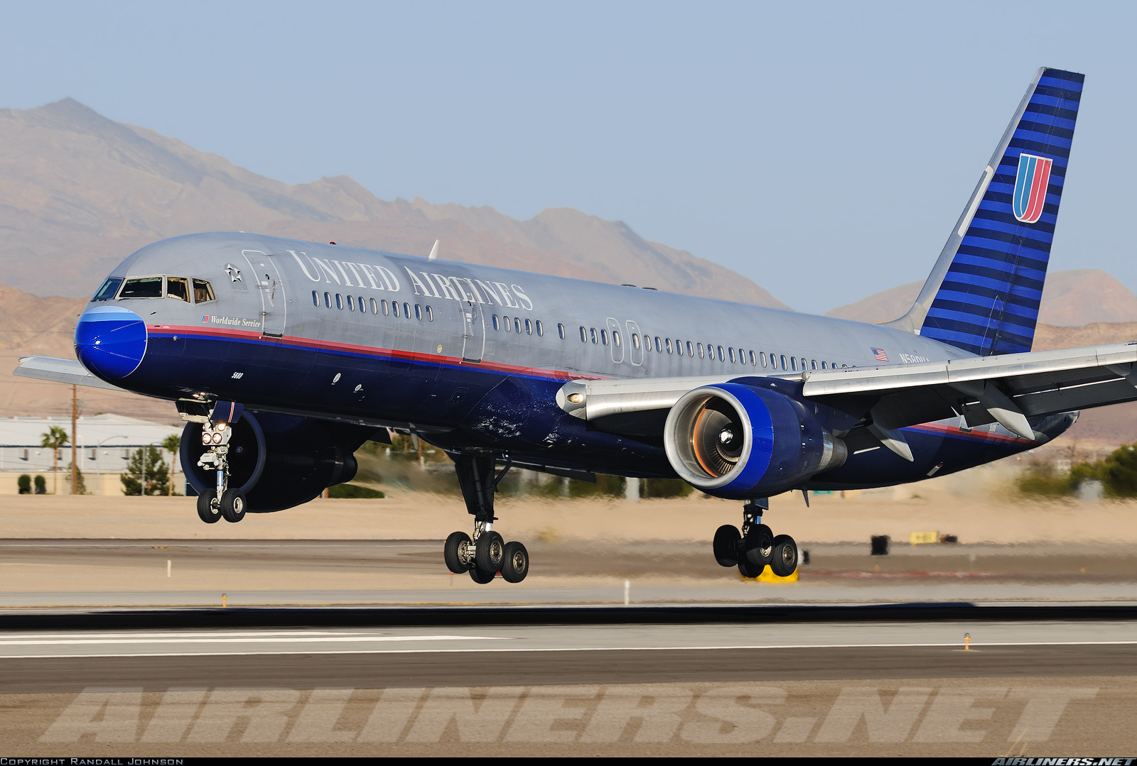
United still had planes in the Battleship livery when they merged with CO. Introducing a fully new livery would result in three different liveries of varying names and logos flying around. It would take a good amount of time to paint 1400 aircraft, so what they did made total sense. They took a livery that was recognized and respected, plus was already on half the fleet.
On the topic of a refreshed livery, I agree that purple will likely be part of it. I can see a tail with the "globe edge" shown above as a pattern in a dark purple with blue behind, and maybe a white globe on top? Just a quick thought, but I think it'd be nice. Something along those lines. No way they are getting rid of the globe now; many people are just now associating it with United and not Continental.
No that clearly wasn't the messaging. "Jailbird Jeff Smisek" wanted to keep the livery out of sheer ego and stubbornness. Remember the comment "Well I'd like to keep the logo because I made it!" comment? Which, of course he probably didn't but he was an absolute egotist and many of the decisions he made still haunt the airline today. Mainly because they bet the farm on his decisions and lost to DL in the long run. UAL had 60% of it's mainline fleet at the time painted and on larger planes. It essentially was a wash, but it was done out of ego alone and nothing else.
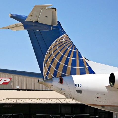
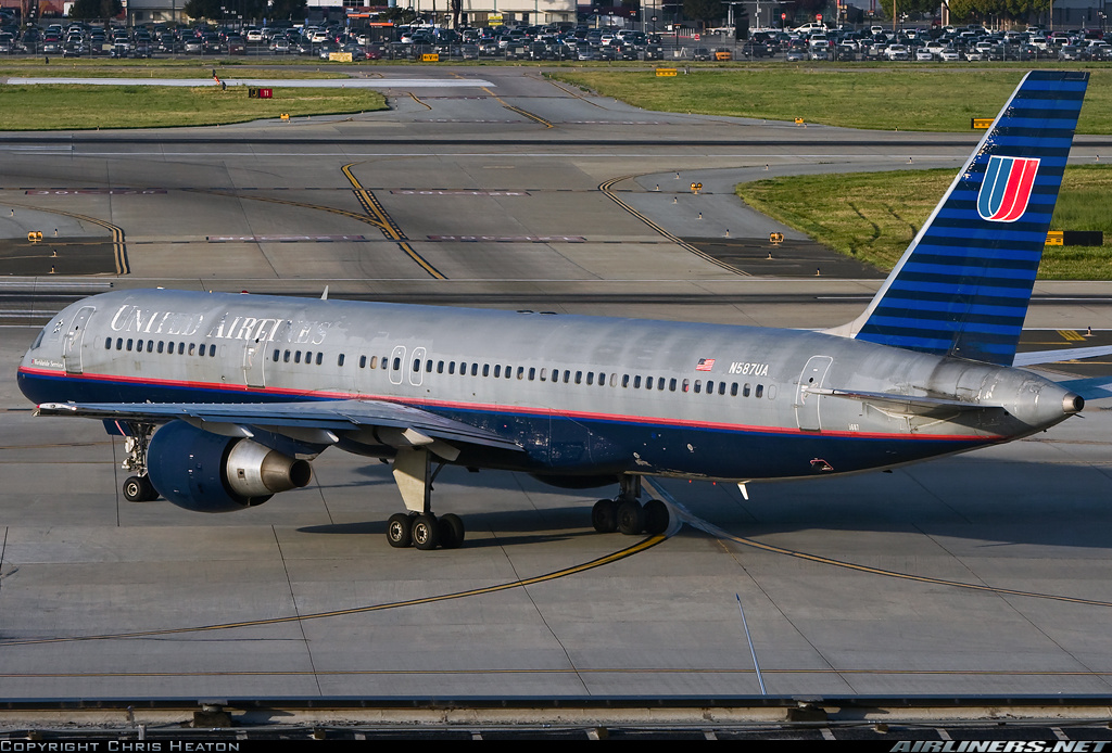
I was actually really upset after merger that they went with a livery that was almost 25 years old at the time. UAL's "Rising Blue" scheme was absolutely beautiful compared to any of the other major carriers at the time and even looks great now. CO's scheme was good for CO (already post date by 2010, IMHO) but was ridiculous as a monumental merger between the two airlines.
Say what people will about the battleship schemie too, it looked terrible when chipped but amazing when it was clean. And don't kid yourself, CO's paint had some examples of chipping by 2010 as well on the tail and logo.
Nowadays I'm OK with them moving on with the globe as long as it's a *TRANSFORMATIVE* different example and not just a color change from the CO logo. This is a long time coming, and it's not shocking to see this airline with it's "Chicago Style" cronyism drag it's feet to make decisions very slowly.
I respect all of your opinion on this. But I have to take issue with this statement.
“And don't kid yourself, CO's paint had some examples of chipping by 2010 as well on the tail and logo.”
CO kept its fleet perfect inside and out before the merger. None of the chipping outside or faded worn cabins we see now.
If there a single chipped CO livery pic out there, there is a thousand battleship grays for it.
CO actually had a toll free hotline number for any employee to call in from the aircrafts in seat phones if they saw an issue. Can you imagine how many thousands of phone call such a program would generate today??
CALTECH wrote:tpaewr wrote:N649DL wrote:
No that clearly wasn't the messaging. "Jailbird Jeff Smisek" wanted to keep the livery out of sheer ego and stubbornness. Remember the comment "Well I'd like to keep the logo because I made it!" comment? Which, of course he probably didn't but he was an absolute egotist and many of the decisions he made still haunt the airline today. Mainly because they bet the farm on his decisions and lost to DL in the long run. UAL had 60% of it's mainline fleet at the time painted and on larger planes. It essentially was a wash, but it was done out of ego alone and nothing else.
I was actually really upset after merger that they went with a livery that was almost 25 years old at the time. UAL's "Rising Blue" scheme was absolutely beautiful compared to any of the other major carriers at the time and even looks great now. CO's scheme was good for CO (already post date by 2010, IMHO) but was ridiculous as a monumental merger between the two airlines.
Say what people will about the battleship schemie too, it looked terrible when chipped but amazing when it was clean. And don't kid yourself, CO's paint had some examples of chipping by 2010 as well on the tail and logo.
Nowadays I'm OK with them moving on with the globe as long as it's a *TRANSFORMATIVE* different example and not just a color change from the CO logo. This is a long time coming, and it's not shocking to see this airline with it's "Chicago Style" cronyism drag it's feet to make decisions very slowly.
I respect all of your opinion on this. But I have to take issue with this statement.
“And don't kid yourself, CO's paint had some examples of chipping by 2010 as well on the tail and logo.”
CO kept its fleet perfect inside and out before the merger. None of the chipping outside or faded worn cabins we see now.
If there a single chipped CO livery pic out there, there is a thousand battleship grays for it.
CO actually had a toll free hotline number for any employee to call in from the aircrafts in seat phones if they saw an issue. Can you imagine how many thousands of phone call such a program would generate today??
His post is very misinformed. Tired old false argument. We were appalled at the sight of many subUAL aircraft. Oh, they maintained them safely, but they looked like crap. He will not post a picture of a bad subCAL livery, because there really weren't any. On the other hand.....
Volaris320 wrote:I'm happy that United is finally updating its livery after nearly nine years of continuing the 1991 Continental livery but with the United name. I initially thought they were also going to introduce a new logo from scratch, like American and Southwest did respectively in 2013 and 2014. The Continental globe needs to go, IMO. And United ought to introduce a more modern tulip logo for instance.
However, I liked those concept liveries; perhaps try doing the same thing but with the tulip instead of the globe.
NYPECO wrote:Volaris320 wrote:I'm happy that United is finally updating its livery after nearly nine years of continuing the 1991 Continental livery but with the United name. I initially thought they were also going to introduce a new logo from scratch, like American and Southwest did respectively in 2013 and 2014. The Continental globe needs to go, IMO. And United ought to introduce a more modern tulip logo for instance.
However, I liked those concept liveries; perhaps try doing the same thing but with the tulip instead of the globe.
I think the globe represents United more than the tulip, since they're a global airline with an expanding international network. That's why the globe is being added to new Polaris cabins and other branding. What is a tulip supposed to represent?

sunking737 wrote:Of all the folks at UAL, and all the folks here on Airliners, No one has leaked what we should see next month??
CLEguy wrote:NYPECO wrote:Volaris320 wrote:I'm happy that United is finally updating its livery after nearly nine years of continuing the 1991 Continental livery but with the United name. I initially thought they were also going to introduce a new logo from scratch, like American and Southwest did respectively in 2013 and 2014. The Continental globe needs to go, IMO. And United ought to introduce a more modern tulip logo for instance.
However, I liked those concept liveries; perhaps try doing the same thing but with the tulip instead of the globe.
I think the globe represents United more than the tulip, since they're a global airline with an expanding international network. That's why the globe is being added to new Polaris cabins and other branding. What is a tulip supposed to represent?
It’s not a “tulip;” it’s a stylized U!
kaitakfan wrote:CLEguy wrote:NYPECO wrote:
I think the globe represents United more than the tulip, since they're a global airline with an expanding international network. That's why the globe is being added to new Polaris cabins and other branding. What is a tulip supposed to represent?
It’s not a “tulip;” it’s a stylized U!
It’s not a stylized U, it’s a stylized Shield that played into a Stylized U. Clear as mud?
CLEguy wrote:kaitakfan wrote:CLEguy wrote:
It’s not a “tulip;” it’s a stylized U!
It’s not a stylized U, it’s a stylized Shield that played into a Stylized U. Clear as mud?
I suppose you could be right, but I always thought it was a U: https://thegate.boardingarea.com/rememb ... -designer/

lostsound wrote:Just preparing y'all for the inevitable:
gregn21 wrote:lostsound wrote:Just preparing y'all for the inevitable:
Well this would be a total disaster
lostsound wrote:Just preparing y'all for the inevitable:
lostsound wrote:Just preparing y'all for the inevitable:
fun2fly wrote:So, I'm in Aspen on Tuesday (I got out!!) and behind the check in desk is a purple hued oversize globe on what looks to be brand new signage. Could it be this visible already? If anyone can IM me how to post the pic, I can do so. I couldn't figure it out (sad, I know). I think it would look sharp on a plane.
EChid wrote:N649DL wrote:Any chance of a full on blue livery that covers the entire aircraft and fully ditch the Euro White colors (EG: "Battleship Gray 90s scheme") or would that be way too expensive to maintain?
I'd say close to zero. UA has done dark colours already and it looks shabby after a few years.
fun2fly wrote:So, I'm in Aspen on Tuesday (I got out!!) and behind the check in desk is a purple hued oversize globe on what looks to be brand new signage. Could it be this visible already? If anyone can IM me how to post the pic, I can do so. I couldn't figure it out (sad, I know). I think it would look sharp on a plane.
TWA772LR wrote:lostsound wrote:Just preparing y'all for the inevitable:
I'm actually ok with this. I'd like to see what it'd look like with the globe facing the other way, if you don't mind.
lostsound wrote:Just preparing y'all for the inevitable:
Kno wrote:lostsound wrote:Just preparing y'all for the inevitable:
On one hand I like it.
On the other hand this exact livery is already on a number of airlines in 2019.
lostsound wrote:Just preparing y'all for the inevitable:
afcjets wrote:EChid wrote:N649DL wrote:Any chance of a full on blue livery that covers the entire aircraft and fully ditch the Euro White colors (EG: "Battleship Gray 90s scheme") or would that be way too expensive to maintain?
I'd say close to zero. UA has done dark colours already and it looks shabby after a few years.
One of my favorite all time color schemes was TranStar. It was solid purple but looked teal blue in certain lighting. They always looked great so it's either purple holds up better or they went out of business too soon. Here it is...
https://www.airliners.net/photo/TranSta ... YwTw%3D%3D
fun2fly wrote:So, I'm in Aspen on Tuesday (I got out!!) and behind the check in desk is a purple hued oversize globe on what looks to be brand new signage. Could it be this visible already? If anyone can IM me how to post the pic, I can do so. I couldn't figure it out (sad, I know). I think it would look sharp on a plane.
WALmsp wrote:lostsound wrote:Just preparing y'all for the inevitable:
I'd like the titles to be BELOW the windows rather than having that dotted line running through
lostsound wrote:
lostsound wrote:Just preparing y'all for the inevitable:
lostsound wrote:Just preparing y'all for the inevitable:
fun2fly wrote:So, I'm in Aspen on Tuesday (I got out!!) and behind the check in desk is a purple hued oversize globe on what looks to be brand new signage. Could it be this visible already? If anyone can IM me how to post the pic, I can do so. I couldn't figure it out (sad, I know). I think it would look sharp on a plane.
KVH68 wrote:lostsound wrote:Just preparing y'all for the inevitable:
This looks great!
I use to hate the globe, but I guess what I really hated was the gold.
questions wrote:N649DL wrote:"Jailbird Jeff Smisek"... many of the decisions he made still haunt the airline today. Mainly because they bet the farm on his decisions and lost to DL in the long run.
What are some examples of his decisions that are still haunting UA today? Just curious. Thanks.
lostsound wrote:Just preparing y'all for the inevitable: