Moderators: richierich, ua900, PanAm_DC10, hOMSaR
Re: Airline with the oldest livery still flying/in use?
I'd have thought Air China. Even brand new planes look 15+ yrs old!
Re: Airline with the oldest livery still flying/in use?
DY789 wrote:I'd have thought Air China. Even brand new planes look 15+ yrs old!
Air China's livery is indeed 'classic', but in my opinion, it is one of the best examples that cheatlines (for some: 'oldfashioned' liveries) can be timeless.
However not the best looking livery in the skies, but never get bored of it either. It is simple, recognizable, I actually like it.
-

- flyinggoat
- Posts: 430
- Joined:
Re: Airline with the oldest livery still flying/in use?
PapaLimaSierra wrote:Surprised that no one has mentioned Philippine Airlines. The basic livery remained untouched since 1986. Font was enlarged only on the 777-300ER in 2009, and the addition of the belly logo and the sunriser on the inner winglets on the A350 back in 2018, with the sunriser on the inner winglets on newly painted A321ceos and A321Nx aircraft.
I mentioned them a few posts before yours, but I didn’t know about the belly logo on the A350. That’s neat!
Re: Airline with the oldest livery still flying/in use?
flyinggoat wrote:I believe Philippine Airlines has had the same livery since the late ‘80s or early ‘90s. One of the most bland liveries out there, IMO.
Eh

And speaking of old.....

Re: Airline with the oldest livery still flying/in use?
PapaLimaSierra wrote:Surprised that no one has mentioned Philippine Airlines.
It was mentioned a few posts above yours.
Surprised you didn't notice it.

Re: Airline with the oldest livery still flying/in use?
330lover wrote:DY789 wrote:I'd have thought Air China. Even brand new planes look 15+ yrs old!
Air China's livery is indeed 'classic', but in my opinion, it is one of the best examples that cheatlines (for some: 'oldfashioned' liveries) can be timeless.
However not the best looking livery in the skies, but never get bored of it either. It is simple, recognizable, I actually like it.
Yeah, that old state airline variation on 1970's Aeroflot still persists, and gives all of their fleet an extremely outdated look.
-

- Rajahdhani
- Posts: 1026
- Joined:
Re: Airline with the oldest livery still flying/in use?
YMHBSpotting wrote:Rajahdhani wrote:Does anyone know when we arrived to a modern-esque Qantas era of the livery?
As far as I can see, the 1971 retro-jet did have cheat lines, but also possessed the iconic Kangaroo tail.
Qantas have had a variation on the Kangaroo logo since the 40s, but the livery most similar today's was introduced in 1984, downward kangaroo leg, gold stripe on the tail and blocky text. There was a minor tweak in 2007, changing the position of the kangaroo leg, dropping the gold stripe, and a font change, but that was superseded in 2016 with the current livery, stylized kangaroo, belly logo, silver stripe, and new font, however some aircraft skipped the 2007 livery completely, being repainted into the 2016 scheme straight from the 1984 one.
1). Wow.
2). A massive thank you!
3). It took me ages to get what little information I could, and this frankly blew me out of the water. May I ask, what resources did you use, if any to keep up on knowledge regarding c/s or liveries, or branding? I ask, fully knowing that this kind of knowledge has come from the history and soul of a career and a likely has nuances and slivers of silver knowledge that the rest of us might not be able to think of (the 'skipping' to 1984 - prior to this, I was having literature flashback).
Kinda odd to ask, but I would be remiss if I didn't - what caused the change in 1984? Of late, and as an American - we often see livery changes after a merger, or emergence from bankruptcy. The best research led me to understand that the 767 was slated for debut.
-
- Rajahdhani
- Posts: 1026
- Joined:
Re: Airline with the oldest livery still flying/in use?
What about Aeropostal (de Venezuela)? An older airline (founded 1929), and looks like the same (admittedly, looking for someone better experienced/connected/knowledged to clarify) dark blue tail, 'wing' logo centered on tail, and white fuselage (admittedly, updates of the titles recently). Regardless, here's to hoping for a brighter future, for both the carrier, and the nation.
-
- YMHBSpotting
- Posts: 23
- Joined:
Re: Airline with the oldest livery still flying/in use?
Rajahdhani wrote:YMHBSpotting wrote:Rajahdhani wrote:Does anyone know when we arrived to a modern-esque Qantas era of the livery?
As far as I can see, the 1971 retro-jet did have cheat lines, but also possessed the iconic Kangaroo tail.
Qantas have had a variation on the Kangaroo logo since the 40s, but the livery most similar today's was introduced in 1984, downward kangaroo leg, gold stripe on the tail and blocky text. There was a minor tweak in 2007, changing the position of the kangaroo leg, dropping the gold stripe, and a font change, but that was superseded in 2016 with the current livery, stylized kangaroo, belly logo, silver stripe, and new font, however some aircraft skipped the 2007 livery completely, being repainted into the 2016 scheme straight from the 1984 one.
1). Wow.
2). A massive thank you!
3). It took me ages to get what little information I could, and this frankly blew me out of the water. May I ask, what resources did you use, if any to keep up on knowledge regarding c/s or liveries, or branding? I ask, fully knowing that this kind of knowledge has come from the history and soul of a career and a likely has nuances and slivers of silver knowledge that the rest of us might not be able to think of (the 'skipping' to 1984 - prior to this, I was having literature flashback).
Kinda odd to ask, but I would be remiss if I didn't - what caused the change in 1984? Of late, and as an American - we often see livery changes after a merger, or emergence from bankruptcy. The best research led me to understand that the 767 was slated for debut.
No problem ahah, most of that is just off the top of my head, I am just a nerdy young avgeek, but this Australian Aviation article was quite helpful https://australianaviation.com.au/2016/10/qantas-reveals-new-livery-and-logo/. The 1984 livery was introduced to coincide with the introduction of the Boeing 767, and to be fair, the cheatline and winged kangaroo were looking pretty dated by the mid eighties, although the retrojet in that scheme is undoubtedly my favourite aircraft to photograph, VH-XZP is the rego. Its also worth noting for the last 10 or so years prior to 1984, QF had solely operated the 747-200 and 747SP. In a similar vein, the 2007 livery was introduced for the arrival of the A380, and the 2016 livery for the 787.
-
- NameOmitted
- Posts: 1433
- Joined:
Re: Airline with the oldest livery still flying/in use?
I think this bird from TransNorthern Aviation has been in these colors for 40 years:
Her sister-ship (in the background) has been repainted, so I don't know how long it will last.
It's cheating, as it's the livery of Kenn Borek Air, who owned the aircraft before TransNorthern.
Perhaps they get the crown. Their webpage says they started in 1955. Does anyone know if this is their original livery?
Re: Airline with the oldest livery still flying/in use?
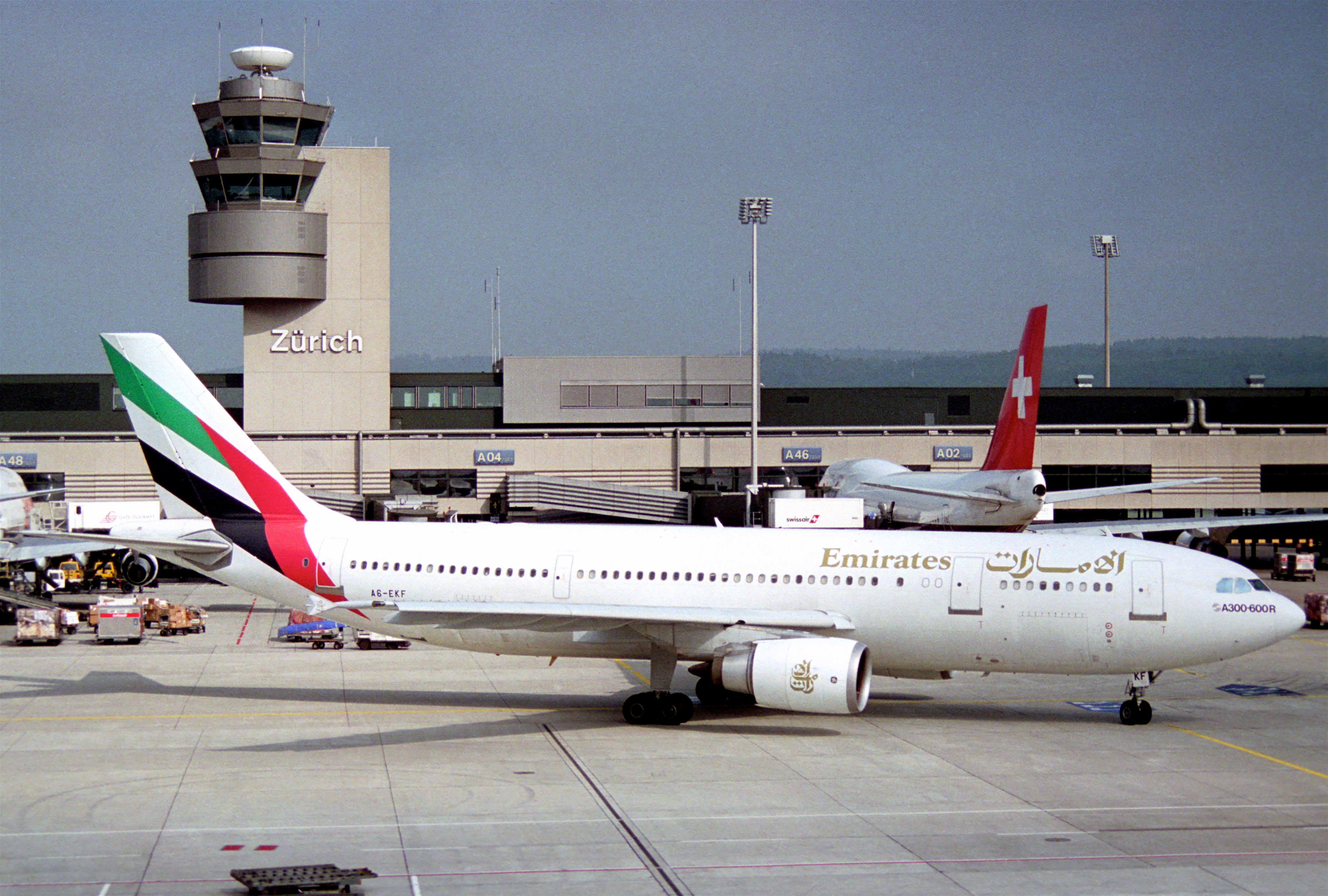
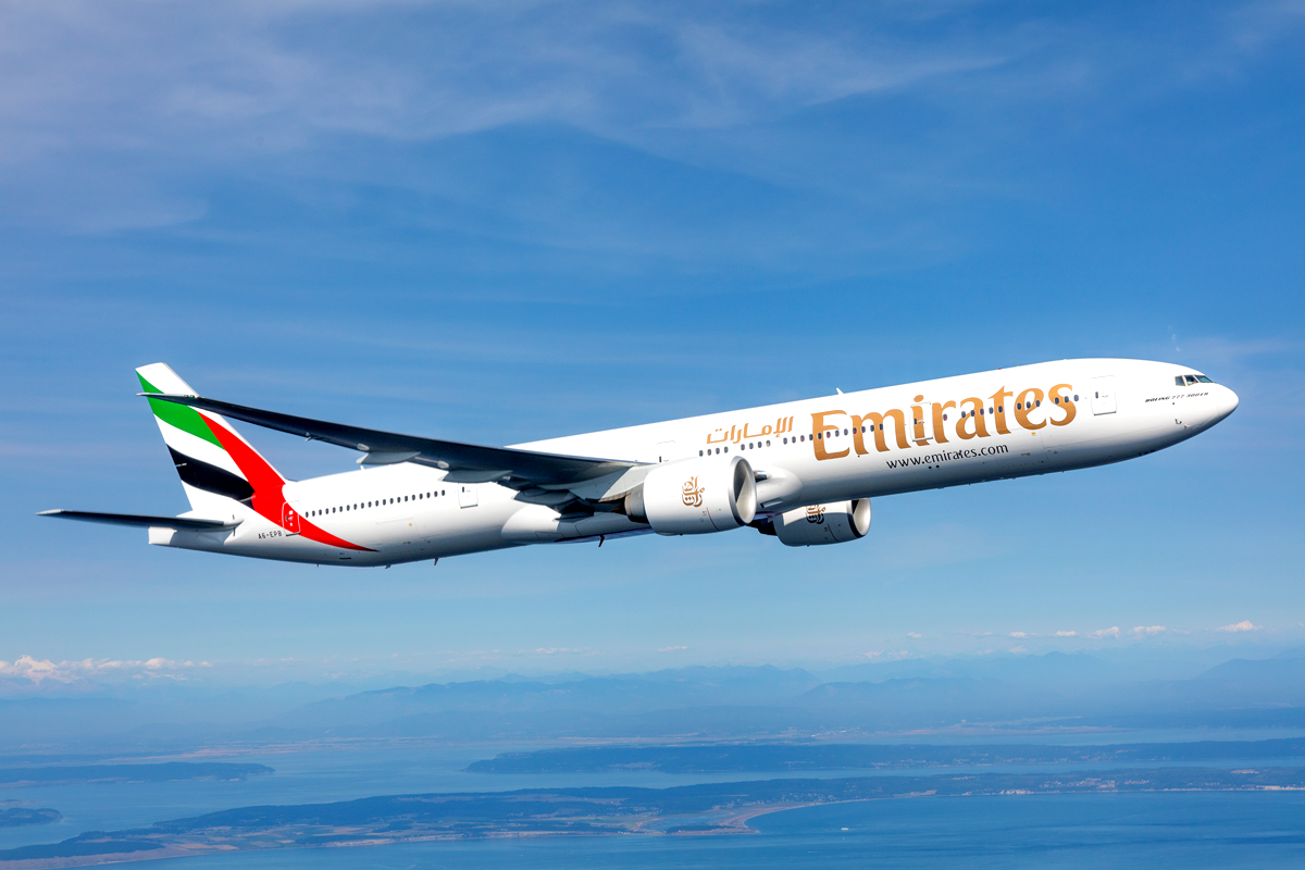
EK livery 1985 vs 2021. Obviously the wording is a bit bigger nowadays but outside of that the livery really hasn't changed much.
-
- AntonioMartin
- Posts: 1610
- Joined:
Re: Airline with the oldest livery still flying/in use?
How about Air Algerie? Aeroflot is also getting a bit old....who else.....I dont know when was the last time Loganair updated heir livery...some of those smaller airlines dont update it too much either since I guess they are less noted by the public? Oh and DHL and UPS their liveries are also getting long on the tooth...
-
- Flyingsottsman
- Posts: 871
- Joined:
Re: Airline with the oldest livery still flying/in use?
Rajahdhani wrote:Does anyone know when we arrived to a modern-esque Qantas era of the livery?
As far as I can see, the 1971 retro-jet did have cheat lines, but also possessed the iconic Kangaroo tail.
1984, when QF lost the cheat line and went Euro white with the red tail, it was like the old UTA livery which I thought was stunning for that time. The new livery for Qantas came in at the same time as QF introduced their new 767s and the new (at the time) 743, Since then the livery has been tweaked a couple of times noting to drastic just very slight changes to the original 1984 livery,
-
- Flyingsottsman
- Posts: 871
- Joined:
Re: Airline with the oldest livery still flying/in use?
oldannyboy wrote:I agree with those who are suggesting that above modifications of liveries are not at all that minor.....
And unfailingly -to me at least- the end result is a livery that is more nondescript and generic... with more white, less color, less character...
I hate the modernised Qantas livery with the "crippled" arm-less 'roo. Hate also the flowy KLM chin-job, as well as the lack of a thicker, more solid, dark blue cheatline. The LH livery without the yellow 'Spiegelei'...well don't even get me started...it's just plain terrible... Yemenia going euro-white (euro-shythe) is bland as overcooked white rice.. and those who have removed the cheatline from the classy LOT livery should serve time in a prison to ponder on their crime...
On a more positive note: I think the people at Alitalia have done a good job, considering they were coming from a truly iconic Landor Associates masterpiece. Kudos to Royal Air Maroc for keeping some colour as well, that looks nice.
And of course hat off to those at TAAG for having the guts to contradict forced meaningless modernisation at all costs, and reinstate some sense in the heads of those who came up with the 'new' design.
Aside from the lack of inspiration and the blandness of the newer designs, I invariably get really worked up whenever I read the presentations (the "spiel" I call it) done by the highly [over]paid and [over]zealous individuals at design companies...the shit we had to listen to and endure in the Lufthansa presentation was beyond laughable. To think they have merely tampered with a classy timeless design, and got paid for actually removing some yellow and changing the shade of blues is nothing short of shameful.
Yes well said I agree with every thing you have said there, IB looks like a Qantas with a bit of yellow in it that day they must have ran out of ideas and gone " ok fellers let go with the Qantas livery and just put a bit of yellow in it" I do like KLM, so glad they did not go Euro white with just the rear end painted, what the hell has Aer Lingus done? Japan Airlines, China Eastern, put some colour or a cheat line somewhere to break up the white. It would be nice for some one today to come up with an original livery. Our airports are boring now no variety of aircraft and very little colour.

Re: Airline with the oldest livery still flying/in use?
Iberia, Cubana, FedEx, UPS

Re: Airline with the oldest livery still flying/in use?
lh346 wrote:Iberia, Cubana, FedEx, UPS
Iberia’s livery is only 8 years old.
Re: Airline with the oldest livery still flying/in use?
Polot wrote:lh346 wrote:Iberia, Cubana, FedEx, UPS
Iberia’s livery is only 8 years old.
Good call Polot - love a good discussion. Saudia just released a couple of special liveries to celebrate their 75th. Feels like their current c/s has been around for a minute.
And, JetBlue? They're not a 'historic' airline, but couldn't one technically say they're still flying in the colors they launched with?
-
- oldannyboy
- Posts: 3074
- Joined:
Re: Airline with the oldest livery still flying/in use?
Flyingsottsman wrote:oldannyboy wrote:I agree with those who are suggesting that above modifications of liveries are not at all that minor.....
And unfailingly -to me at least- the end result is a livery that is more nondescript and generic... with more white, less color, less character...
I hate the modernised Qantas livery with the "crippled" arm-less 'roo. Hate also the flowy KLM chin-job, as well as the lack of a thicker, more solid, dark blue cheatline. The LH livery without the yellow 'Spiegelei'...well don't even get me started...it's just plain terrible... Yemenia going euro-white (euro-shythe) is bland as overcooked white rice.. and those who have removed the cheatline from the classy LOT livery should serve time in a prison to ponder on their crime...
On a more positive note: I think the people at Alitalia have done a good job, considering they were coming from a truly iconic Landor Associates masterpiece. Kudos to Royal Air Maroc for keeping some colour as well, that looks nice.
And of course hat off to those at TAAG for having the guts to contradict forced meaningless modernisation at all costs, and reinstate some sense in the heads of those who came up with the 'new' design.
Aside from the lack of inspiration and the blandness of the newer designs, I invariably get really worked up whenever I read the presentations (the "spiel" I call it) done by the highly [over]paid and [over]zealous individuals at design companies...the shit we had to listen to and endure in the Lufthansa presentation was beyond laughable. To think they have merely tampered with a classy timeless design, and got paid for actually removing some yellow and changing the shade of blues is nothing short of shameful.
Yes well said I agree with every thing you have said there, IB looks like a Qantas with a bit of yellow in it that day they must have ran out of ideas and gone " ok fellers let go with the Qantas livery and just put a bit of yellow in it" I do like KLM, so glad they did not go Euro white with just the rear end painted, what the hell has Aer Lingus done? Japan Airlines, China Eastern, put some colour or a cheat line somewhere to break up the white. It would be nice for some one today to come up with an original livery. Our airports are boring now no variety of aircraft and very little colour.
Hello kilted friend, I couldn't agree more with you.
What's up with IBERIA, binning their amazing red-orange-yellow colors and coming up with that 'smudge' of mustard on top of the tail! Foffukssake!
AND Aer Lingus!!! what's wrong with those people??? They had the PERFECT livery. Now it looks like the branding of lower-end cheap supermarket chain.
Re: Airline with the oldest livery still flying/in use?
lh346 wrote:
Saudia just released a couple of special liveries to celebrate their 75th. Feels like their current c/s has been around for a minute.
Saudia's livery is from 1996, updated in 2012. Think it's a very smart looking livery, specially on the 787s.
-

- eta unknown
- Posts: 3818
- Joined:
Re: Airline with the oldest livery still flying/in use?
Although there was a brief change with the DC-10 (and a merger of sorts with Bahktar), Ariana reverted to their original livery long ago.
Re: Airline with the oldest livery still flying/in use?
Buffalo Airways has been flying the same exact livery since about 1980. But maybe it doesn't count if you still also fly it on the same exact airframe... 
Re: Airline with the oldest livery still flying/in use?
lh346 wrote:Polot wrote:lh346 wrote:Iberia, Cubana, FedEx, UPS
Iberia’s livery is only 8 years old.
Good call Polot - love a good discussion. Saudia just released a couple of special liveries to celebrate their 75th. Feels like their current c/s has been around for a minute.
And, JetBlue? They're not a 'historic' airline, but couldn't one technically say they're still flying in the colors they launched with?
For B6, not really. Logo on the fuselage went from silver and blue small font to all-blue nearly billboard titles. Web URL changed on the cowls. Underbelly went from having a light blue and dark blue to just dark blue that doesn't extend into the nose radome. Tail fin designs have continued to be added and the oldest ones (the classic/original "Stripes", "Super Dots", "Bubbles", "Window Pane" from 2000-2003, original "Tartan" 2004, "Mosaic" 2005) are all gone or being replaced through the re-paint process. The tail fins have constantly been changing since the airline started in 2000, and let's not forget the ton of special paint jobs in their fleet.
It'll be interesting to see what the tail design will be for the first A321CEO repaints as they start this year. All A321CEOs have the Prism tail, wonder if they'll change it.
-
- Flyingsottsman
- Posts: 871
- Joined:
Re: Airline with the oldest livery still flying/in use?
Has Qatar Airways had their scheme from the start, I dont think that livery has changed much. That Orix tail seems to have been around for a long time.
Re: Airline with the oldest livery still flying/in use?
NameOmitted wrote:Her sister-ship (in the background) has been repainted, so I don't know how long it will last.
The aircraft in the background is N777YA of Bush Air. Do you mean YA has been repainted? I've been trying to track it down but last I saw it was de-registered and inactive.
Re: Airline with the oldest livery still flying/in use?
Interesting topic, so when looking at no changes at all over time, including no minor changes, we have winners in TAAG Angola, Sudan Airways. ANA of Japan is interesting but I think should be excluded when looking at their A380 fleet which has a different livery. TAAG Angola and Sudan Airways indeed haven't touched their liveries at all.
A388
A388
-
- GatorClark
- Posts: 108
- Joined:
Re: Airline with the oldest livery still flying/in use?
robleroy121721 wrote:Boeing757100 wrote:GatorClark wrote:Up until 2013, American probably had the oldest without changing as they had the red, white, & blue stripes on the polished metal skin. They only developed a new livery because of the introduction of aircraft with composite structures such as A320 family and the 787. The polished metal debuted in the late 60's and lasted until 2013 as the standard livery.
As stupid as it sounds, do you think AA would have kept the bare metal livery if not for planes like the 787?
Since AAL was under Chapter 11 back then, 2013 marked their exit and their new livery represented that, not just the merger with US Airways. If the composite materials were in the way, they could've gone the same way they did with the A300's and MD-90's.
Not saying I disagree with you, but how many times did they go in and out of Chapter 11 prior to introducing the new livery? What made 2013 any different?
Re: Airline with the oldest livery still flying/in use?
GatorClark wrote:robleroy121721 wrote:Boeing757100 wrote:
As stupid as it sounds, do you think AA would have kept the bare metal livery if not for planes like the 787?
Since AAL was under Chapter 11 back then, 2013 marked their exit and their new livery represented that, not just the merger with US Airways. If the composite materials were in the way, they could've gone the same way they did with the A300's and MD-90's.
Not saying I disagree with you, but how many times did they go in and out of Chapter 11 prior to introducing the new livery? What made 2013 any different?
I'm pretty sure that AA has had only that single Chapter 11 filing.
Re: Airline with the oldest livery still flying/in use?
Although not the same, I'd argue that the current BA livery is basically a refreshed version of their original Negus&Negus livery from the 70's.
Re: Airline with the oldest livery still flying/in use?
oldannyboy wrote:I agree with those who are suggesting that above modifications of liveries are not at all that minor.....
And unfailingly -to me at least- the end result is a livery that is more nondescript and generic... with more white, less color, less character...
I hate the modernised Qantas livery with the "crippled" arm-less 'roo. Hate also the flowy KLM chin-job, as well as the lack of a thicker, more solid, dark blue cheatline. The LH livery without the yellow 'Spiegelei'...well don't even get me started...it's just plain terrible... Yemenia going euro-white (euro-shythe) is bland as overcooked white rice.. and those who have removed the cheatline from the classy LOT livery should serve time in a prison to ponder on their crime...
On a more positive note: I think the people at Alitalia have done a good job, considering they were coming from a truly iconic Landor Associates masterpiece. Kudos to Royal Air Maroc for keeping some colour as well, that looks nice.
And of course hat off to those at TAAG for having the guts to contradict forced meaningless modernisation at all costs, and reinstate some sense in the heads of those who came up with the 'new' design.
Aside from the lack of inspiration and the blandness of the newer designs, I invariably get really worked up whenever I read the presentations (the "spiel" I call it) done by the highly [over]paid and [over]zealous individuals at design companies...the shit we had to listen to and endure in the Lufthansa presentation was beyond laughable. To think they have merely tampered with a classy timeless design, and got paid for actually removing some yellow and changing the shade of blues is nothing short of shameful.
I agree with everything you say, esp regarding the kangaroo amputation, the weird droop nose on KLM and garbage marketing nonsense that the design companies spit out in order to justify whatever changes they have made.
Re: Airline with the oldest livery still flying/in use?
Flyingsottsman wrote:Has Qatar Airways had their scheme from the start, I dont think that livery has changed much. That Orix tail seems to have been around for a long time.
It's evolved twice, similar to Qantas
-Small Orryx, small titles
-Enlarged Oryx stretching beyond tail + larger titles
-Smaller Oryz within tail + larger titles
-
- robleroy121721
- Posts: 102
- Joined:
Re: Airline with the oldest livery still flying/in use?
mga707 wrote:GatorClark wrote:robleroy121721 wrote:
Since AAL was under Chapter 11 back then, 2013 marked their exit and their new livery represented that, not just the merger with US Airways. If the composite materials were in the way, they could've gone the same way they did with the A300's and MD-90's.
Not saying I disagree with you, but how many times did they go in and out of Chapter 11 prior to introducing the new livery? What made 2013 any different?
I'm pretty sure that AA has had only that single Chapter 11 filing.
I second that. I can't really recall American filing for Chapter 11 bankruptcy, even before 9/11. This link in the AA newsroom from 2013 goes into a bit more detail as to what the 2013 livery represented (and represents?).
https://news.aa.com/news/news-details/2 ... fault.aspx
"Our new logo and livery are designed to reflect the passion for progress and the soaring spirit, which is uniquely American..."
Re: Airline with the oldest livery still flying/in use?
PapaLimaSierra wrote:Surprised that no one has mentioned Philippine Airlines. The basic livery remained untouched since 1986. Font was enlarged only on the 777-300ER in 2009, and the addition of the belly logo and the sunriser on the inner winglets on the A350 back in 2018, with the sunriser on the inner winglets on newly painted A321ceos and A321Nx aircraft.
One of the worst liveries IMO.
Re: Airline with the oldest livery still flying/in use?
OK so whose the winner? Singapore? Or was that debunked?
Re: Airline with the oldest livery still flying/in use?
robleroy121721 wrote:mga707 wrote:GatorClark wrote:
Not saying I disagree with you, but how many times did they go in and out of Chapter 11 prior to introducing the new livery? What made 2013 any different?
I'm pretty sure that AA has had only that single Chapter 11 filing.
I second that. I can't really recall American filing for Chapter 11 bankruptcy, even before 9/11. This link in the AA newsroom from 2013 goes into a bit more detail as to what the 2013 livery represented (and represents?).
https://news.aa.com/news/news-details/2 ... fault.aspx
"Our new logo and livery are designed to reflect the passion for progress and the soaring spirit, which is uniquely American..."
AA has indeed only filed Ch. 11 once ever; this was pointed out by Peter Greenberg in a CNBC documentary from 2007 (that I'll link below). Man, I miss that old branding.
https://www.youtube.com/watch?v=y9A1bYVUuSA
Re: Airline with the oldest livery still flying/in use?
I was in Charlotte a week ago and was surprised to see an American Airlines 738 in the old bare metal livery along side a 738 Astro-jet. I wish I had taken a picture.
Re: Airline with the oldest livery still flying/in use?
beachview wrote:I do consider Singapore's livery to be the same.OK so whose the winner? Singapore? Or was that debunked?
Anyway, here's a video which explains SIA's different liveries along the years.... It states that the actual livery was introduced un 1988 I believe? That would also make that livery a good contender as there are probably not many that old neither...
https://m.youtube.com/watch?v=QyWwJkRQoyE
Maurice
-
- NameOmitted
- Posts: 1433
- Joined:
Re: Airline with the oldest livery still flying/in use?
Diverskii wrote:NameOmitted wrote:Her sister-ship (in the background) has been repainted, so I don't know how long it will last.
The aircraft in the background is N777YA of Bush Air. Do you mean YA has been repainted? I've been trying to track it down but last I saw it was de-registered and inactive.
I've no such information. I was just not placing her with any of the current fleet, and one of the current fleet has a fresh (sort of retro-looking) livery, so I made an incorrect assumption.
-
- skipness1E
- Posts: 5647
- Joined:
Re: Airline with the oldest livery still flying/in use?
JannEejit wrote:330lover wrote:DY789 wrote:I'd have thought Air China. Even brand new planes look 15+ yrs old!
Air China's livery is indeed 'classic', but in my opinion, it is one of the best examples that cheatlines (for some: 'oldfashioned' liveries) can be timeless.
However not the best looking livery in the skies, but never get bored of it either. It is simple, recognizable, I actually like it.
Yeah, that old state airline variation on 1970's Aeroflot still persists, and gives all of their fleet an extremely outdated look.
Outdated = "BAD"
Retrojet = "Best thing EVER!"
Modern would be China Eastern? Consistency is so rare, taste so subjective. Almost NOBODY liked the 1970s BA Negus branding at the time, Landor even less so. But somehow the memory lies and we now remember them as iconic?
-
- Flyingsottsman
- Posts: 871
- Joined:
Re: Airline with the oldest livery still flying/in use?
What about Continental's livery, I know worn by United now, but when that was introduced in 1992, same colours and the Globe tail still worn on the United aircraft? I know United has made a big change now, but the basic livery has been around 29 years does that count?
-
- robleroy121721
- Posts: 102
- Joined:
Re: Airline with the oldest livery still flying/in use?
FlyThiz wrote:I was in Charlotte a week ago and was surprised to see an American Airlines 738 in the old bare metal livery along side a 738 Astro-jet. I wish I had taken a picture.
That's the heritage livery on N921NN. Sadly, it doesn't have the AA.com and stripes on the winglets. I remember seeing a plane take-off from the distance and somehow shining way more than planes to these days. Checked on FR24 and it was indeed N921NN. I do miss the days of the bare metal livery, no matter how old it was.
As for the main topic, I'd say Singapore's livery could definitely take the award as the oldest still flying. True, they've had font updates and such but it's retained the same logo and stripe design from the days Pan Am still had their globe livery flying around.
Who is online
Users browsing this forum: Antdec23, Bert65, DH106, drerx7, eireplane, Fiend, FluidFlow, integrator, JAmie2k9, JerseyFlyer, kalvado, LTEN11, magtje, Mbowlesy, oskarclare, PA515, SelandiaBaru, Singapore 777, tautliner, TrafficCop, vicentezc, VX321, yowflyboy and 236 guests