Which generally well-liked liveries do you not like?
I have a really controversial one... United's Saul Bass livery. First off, it looks a bit "dry" IMO. I mean, I can see how it's "bright and cheerful" and would fit their "Friendly Skies" slogan, but still, I don't like the shade of orange that they use, and I find it dry and dull. Speaking of orange, I don't associate UA with it. I know, it's because of when I was born, but still, I associate UA with blue, not orange. Battleship Grey and Rising Blue say "United" more to me.
Speaking of Battleship Grey, now that was an amazing livery. It is (was?) very elegant, classy, and professional, and probably my favorite livery on the Queen of the Skies. The only downside is how faded it looked in its later years. But I'm getting off topic.
This is just my opinion, take it with a grain of salt.
Moderators: richierich, ua900, PanAm_DC10, hOMSaR
Re: Overrated Airline liveries
I have similar feelings about AA's bare-metal livery. Yes, it was objectively iconic - no arguing that at all - but in later years it was also looking incredibly dated, and the increasing use of composite parts on the aircraft meant a patchwork of light gray paint covering those areas (to the extent that the eventually painted the entire vertical stabilizer light gray for consistency).
I always liked the Eagle version of that livery better.
I always liked the Eagle version of that livery better.
-

- bfitzflyer
- Posts: 913
- Joined:
Re: Overrated Airline liveries
The Braniff flyer colors was hideous. I guess I am not being too restrained, lol. Also was not a fan of the NW Bowling shoe.
-
- PatrickZ80
- Posts: 5801
- Joined:
Re: Overrated Airline liveries
Agreed about the AA bare metal livery, they kept it for way too long. Should have been retired decades earlier. It was okay when it was first introduced, it fitted the time. I wouldn't say it was one of the most beautiful liveries back then but it was acceptable. However when the time came to replace it, they didn't. They desperately held on to it until they couldn't anymore.
Another example of an overrated livery would be the BA Landor livery. People say it's iconic, I don't feel that way. I just don't have anything with it.
Another example of an overrated livery would be the BA Landor livery. People say it's iconic, I don't feel that way. I just don't have anything with it.
-
- bunumuring
- Posts: 2849
- Joined:
Re: Overrated Airline liveries
Hey guys,
Grey and navy / dark blue on an airliner,,, nah!
United's battleship grey and BA's Landor both massively overrated. The so-called 'interim' BA scheme between Landor and World Tails / Utopia showed what could have been.
Another overrated livery imho is the current Royal Jordanian: I love the 'idea' and I love the colours but together it is way too fussy and a mess.
Take care,
Bunumuring
-
- BoeingERJ1000
- Posts: 583
- Joined:
Re: Overrated Airline liveries
PatrickZ80 wrote:Agreed about the AA bare metal livery, they kept it for way too long. Should have been retired decades earlier. It was okay when it was first introduced, it fitted the time. I wouldn't say it was one of the most beautiful liveries back then but it was acceptable. However when the time came to replace it, they didn't. They desperately held on to it until they couldn't anymore.
Another example of an overrated livery would be the BA Landor livery. People say it's iconic, I don't feel that way. I just don't have anything with it.
Regarding the AA Bare Metal livery, I kind of like how long they held on to it. Sure, it was outdated, but it's interesting to have liveries that have lasted for so long, and they stand out.
As for BA Landor, like for UA's Saul Bass livery, I don't have anything with it either, but I like it a lot more as I find it quite beautiful and elegant.
-
- BoeingERJ1000
- Posts: 583
- Joined:
Re: Overrated Airline liveries
bfitzflyer wrote:The Braniff flyer colors was hideous. I guess I am not being too restrained, lol. Also was not a fan of the NW Bowling shoe.
Interesting. The Braniff Fying colors is one of my favorite liveries, a very original scheme. But I can see how you could think of them as hideous.
And the NW Bowling Shoe is (for now) my favorite livery! Although, it does look odd at first glance.
Re: Overrated Airline liveries
There's not a lot to overrate as most of it is dull compared to what Condor rolled out.

Re: Overrated Airline liveries
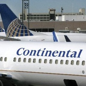
Disagree about the UA Battleship Gray livery. I think it's one of the worst in history. Very stuffy, corporate-feeling. The stripes on the tail just make it even more so, they looked to me like a ledger book. The US Airways livery of the same era, which was essentially a United plane flying upside-down (both liveries were conceived by the same person) is just as bad. But I absolutely loved the liveries that both US and UA replaced the Blue/Gray with. Blue Rising was an amazing livery that was criminally short-lived. When the merged UA/CO adopted the Continental livery (another really overrated livery) I was very disappointed.
-
- BoeingERJ1000
- Posts: 583
- Joined:
Re: Overrated Airline liveries
vatveng wrote:Disagree about the UA Battleship Gray livery. I think it's one of the worst in history. Very stuffy, corporate-feeling. The stripes on the tail just make it even more so, they looked to me like a ledger book. The US Airways livery of the same era, which was essentially a United plane flying upside-down (both liveries were conceived by the same person) is just as bad. But I absolutely loved the liveries that both US and UA replaced the Blue/Gray with. Blue Rising was an amazing livery that was criminally short-lived. When the merged UA/CO adopted the Continental livery (another really overrated livery) I was very disappointed.
I can see how UA Battleship Grey and US (which I agree, was just an upside-down UA plane) looked corporate, and I agree that US's livery wasn't great. Its successor livery was a lot better. Regarding Rising Blue, I didn't like it as much as the Grey, but it's a lot better than the CO livery.
The current UA livery, IMO, is what the UA/CO livery should've been all along. It uses Rising Blue's color palette and the CO Globe livery format.

Re: Overrated Airline liveries
The Air France livery that is usually covered in dirt 
Re: Overrated Airline liveries
sydramper wrote:The Air France livery that is usually covered in dirt
Haha which one
-
- Boeing757100
- Posts: 1887
- Joined:
Re: Overrated Airline liveries
Most overrated livery? That's a bit of a tough one, but I'll try to think.
NW Bowling shoe in my opinion, though I will get flamed. It was a solid livery but didn't really age well. The final NW silver livery looked more modern in my opinion but that's subjective.
Same I should say for Continental. Titles just looked like someone enlarged a times new roman font and plastered it there. Though the globe was cool, UA merger did it ugly if you ask me.
Re: Overrated Airline liveries
The Peter Max 777 - so glad that thing (and the thread in regards to it) is long gone.

Re: Overrated Airline liveries
I personally am not a fan of UA's newest livery. Why did they not paint the dorsal fin of the 737? I noticed CO didn't do that either in previous liveries.
I also dislike CX's current look, the previous one was much nicer.
-Rowen
I also dislike CX's current look, the previous one was much nicer.
-Rowen
-

- gunsontheroof
- Posts: 3928
- Joined:
Re: Overrated Airline liveries
vatveng wrote:Disagree about the UA Battleship Gray livery. I think it's one of the worst in history. Very stuffy, corporate-feeling. The stripes on the tail just make it even more so, they looked to me like a ledger book. The US Airways livery of the same era, which was essentially a United plane flying upside-down (both liveries were conceived by the same person) is just as bad. But I absolutely loved the liveries that both US and UA replaced the Blue/Gray with. Blue Rising was an amazing livery that was criminally short-lived. When the merged UA/CO adopted the Continental livery (another really overrated livery) I was very disappointed.
Agreed on the battleship. I thought that livery was great when it was new/I was young, but it has a very “trying too hard in the 1990s” vibe now. Then again, it’s not held in particularly high regard around here, so I suppose that might not be the hottest take.
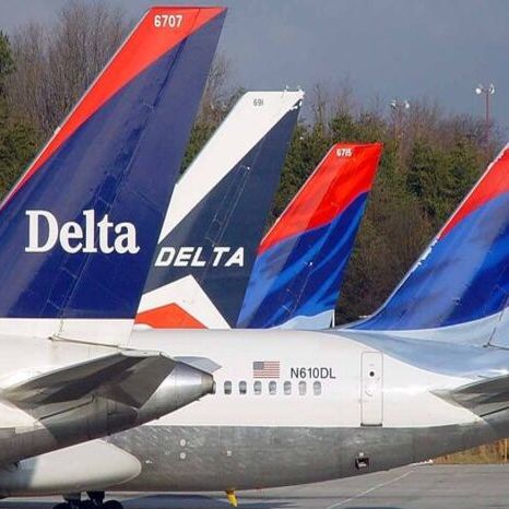
I don’t care much for Delta’s current livery and never have. It’s not especially abominable, I just think it reeks of design meetings where the words “professional” and “clean” were flying around the room every day.

Re: Overrated Airline liveries
Air New Zealand's current livery. The black and white is so dull and just doesn't represent the country as well as the teal/pacific wave colours did. Although the black liveries (NNA, OKQ, OAB etc) look quite sharp.

Re: Overrated Airline liveries
LH's current scheme. Cannot understand why they abandoned the blue-gold-white of past years.
-
- PANAMsterdam
- Posts: 470
- Joined:
Re: Overrated Airline liveries
macsog6 wrote:LH's current scheme. Cannot understand why they abandoned the blue-gold-white of past years.
It’s a very white plane now with just a black… eh… blue tail and some yellow cookie crumbs next to the doors.
-
- RyanairGuru
- Posts: 10195
- Joined:
Re: Overrated Airline liveries
I have to agree with BA Landor. I said this a few days ago in another thread, but the grey looked incredibly drab and dreary on a drizzly English day (so most of the time). The colour blended with the overcast sky and was thoroughly dispiriting. The 2019 version, which used the brilliant white of the current colour scheme, looked much better IMHO, but also showed how incredibly dated the design would be if it was still around.
United battle ship was arguably even more inspired by the design cues of ‘late 80s/early 90s corporate executive’ than BA. Someone upthread said the lines on the tail look like a ledger. I can see that now, but it always reminded me of a pinstripe suit. The worse part of that livery though was how badly it faded. It could look sharp when freshly painted, but by the end the aircraft looked hideous.
The worse part about the early 90s though was serif fonts. United, US Air/US Airways and Continental all used sans-serif fonts in the 80s, but then switched to serif in the 90s. US Air/US Airways are the worse offender, keeping it through three variations of their livery (final US Air, both US Airways). Despite always being a Continental fan, I agree that their livery was overdue for a refresh by the time the latest United livery was unveiled. However, I personally think United got about five more years out of the old livery by switching to the block sans-serif font. The renderings when the merger was announced, using the Continental font, were horrifying, and the short lived second version without the stem on the U weren’t much better. Switching to a much more modern font was a smart idea, although they should have consulted someone in marketing much sooner than they evidently did.
Re: Overrated Airline liveries
gunsontheroof wrote:I don’t care much for Delta’s current livery and never have. It’s not especially abominable, I just think it reeks of design meetings where the words “professional” and “clean” were flying around the room every day.
I'm not a huge fan of the current "Citgo Widget" livery, either, but yet - among the current liveries of the "Big Three" - it's the one I like the most.
-
- BoeingERJ1000
- Posts: 583
- Joined:
Re: Overrated Airline liveries
PANAMsterdam wrote:macsog6 wrote:LH's current scheme. Cannot understand why they abandoned the blue-gold-white of past years.
It’s a very white plane now with just a black… eh… blue tail and some yellow cookie crumbs next to the doors.
One of my least favorite liveries out there. It's somewhat classy and elegant, but still incredibly boring and dull.
Re: Overrated Airline liveries
Uniteds blue tulip was the best they ever did before going knockoff Continental.
Who is online
Users browsing this forum: 817Dreamliiner and 45 guests