Page 1 of 5
LotmaniaK photos
Posted: Sat Oct 15, 2016 10:09 am
by LotmaniaK
Re: LotmaniaK photos
Posted: Thu Oct 20, 2016 8:30 pm
by LotmaniaK
Re: LotmaniaK photos
Posted: Sun Oct 23, 2016 9:54 am
by airkas1
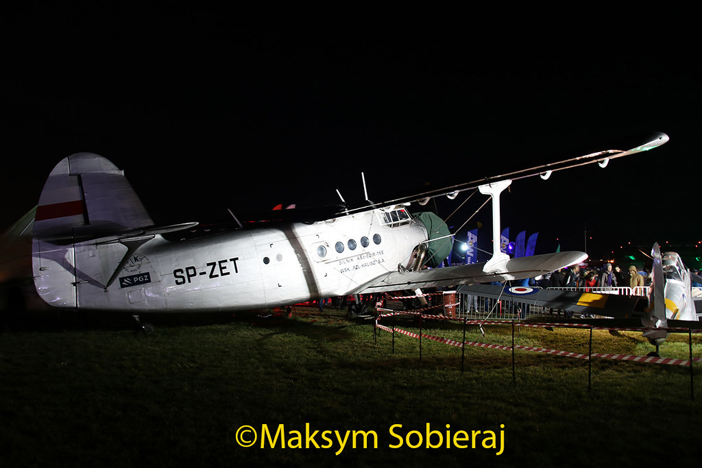
AN2: Could use a bit more brightness (except the plane, otherwise it will be overexposed).
MiG29: Looks slightly high in frame, but otherwise passable.
DHC1: Fuselage & wing look a litte blurry/out of focus. Needs ssome more brightness (same as the AN2).
EC35: Needs more brightness, smaller size would be better.
EC35: Blurry/out of focus.
R22: Looks passable (new to the DB).
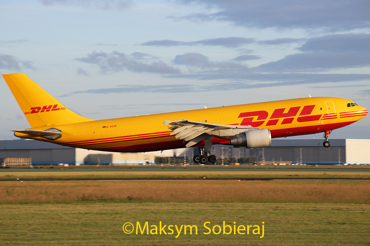
DHL: Looks passable, but quite a tight crop on the left side.
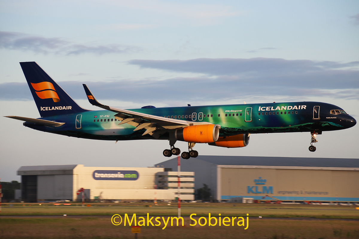
ICE: Needs to be brighter.
Re: LotmaniaK photos
Posted: Fri Oct 28, 2016 6:42 pm
by LotmaniaK
Re: LotmaniaK photos
Posted: Sat Oct 29, 2016 1:33 pm
by LotmaniaK
Re: LotmaniaK photos
Posted: Wed Nov 02, 2016 10:45 am
by airkas1
LotmaniaK wrote:
Excellent!
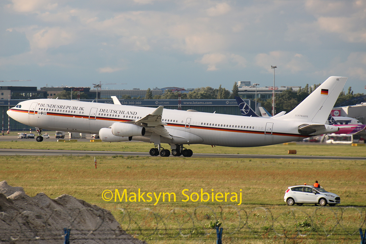
A340 (German): Oversharpened, CCW, marginal quality.
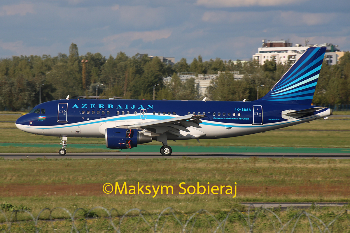
A319 (Azerbaijan): Oversharpened.
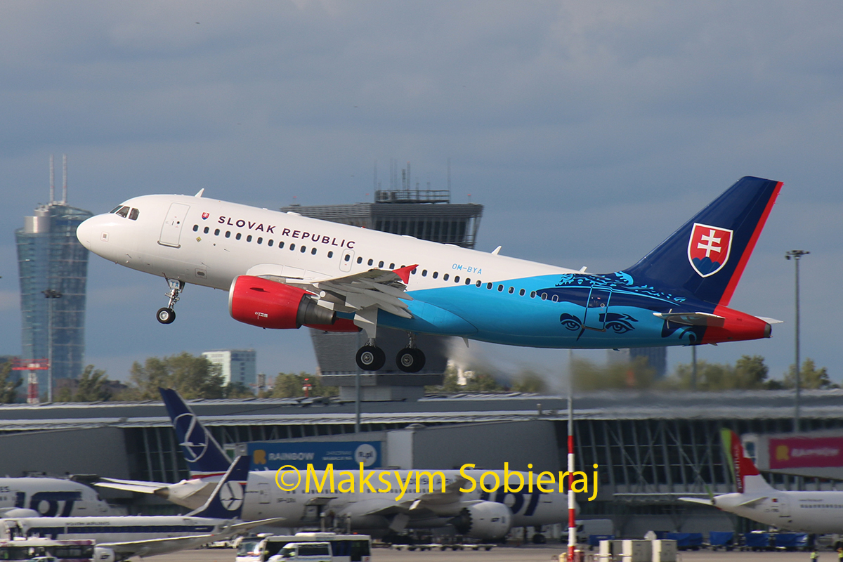
A319 (Slovak): Distance, quality.
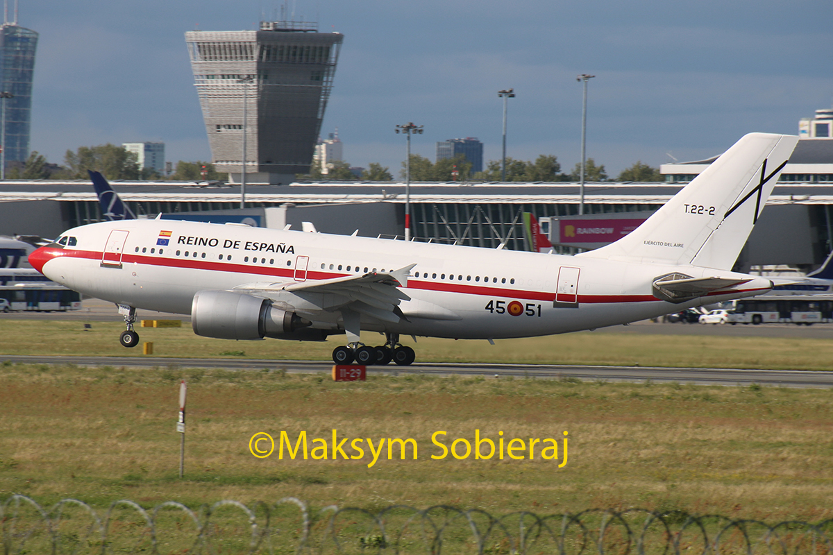
A310 (Spain): Oversharpened-ish, CCW, marginal quality.
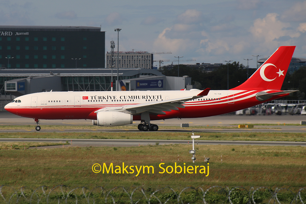
A330 (Turkish): Cheatlines oversharpened.
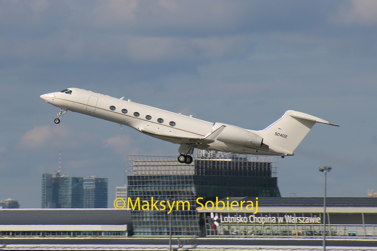
GLF4 (USA): Distance, blurry, quality.
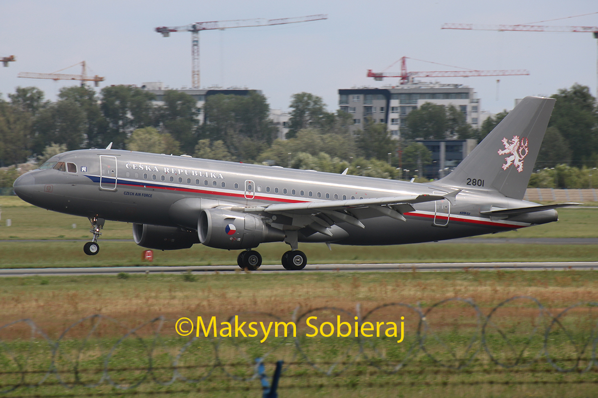
A319 (Czech): Blurry, low contrast-ish, quality.
Re: LotmaniaK photos
Posted: Thu Nov 03, 2016 9:37 pm
by LotmaniaK
Re: LotmaniaK photos
Posted: Thu Nov 03, 2016 10:22 pm
by airkas1
The aft section is a bit blurry and needs some CW. Also a common frame I think.
Re: LotmaniaK photos
Posted: Fri Nov 04, 2016 7:56 pm
by LotmaniaK
Re: LotmaniaK photos
Posted: Sat Nov 05, 2016 11:05 am
by LotmaniaK
Re: LotmaniaK photos
Posted: Fri Nov 11, 2016 10:28 am
by LotmaniaK
Re: LotmaniaK photos
Posted: Sun Nov 13, 2016 9:12 am
by LotmaniaK
Re: LotmaniaK photos
Posted: Sun Nov 13, 2016 10:37 am
by spompert
Hello, the last one I would say looks a bit out of focus/soft or even blurry. The three above look a bit soft and grainy. I would say not good enough to upload without a bit more editing. There is also a very tight crop for the LOT and the USAF has a bit loose crop
Re: LotmaniaK photos
Posted: Tue Nov 15, 2016 3:15 pm
by airkas1
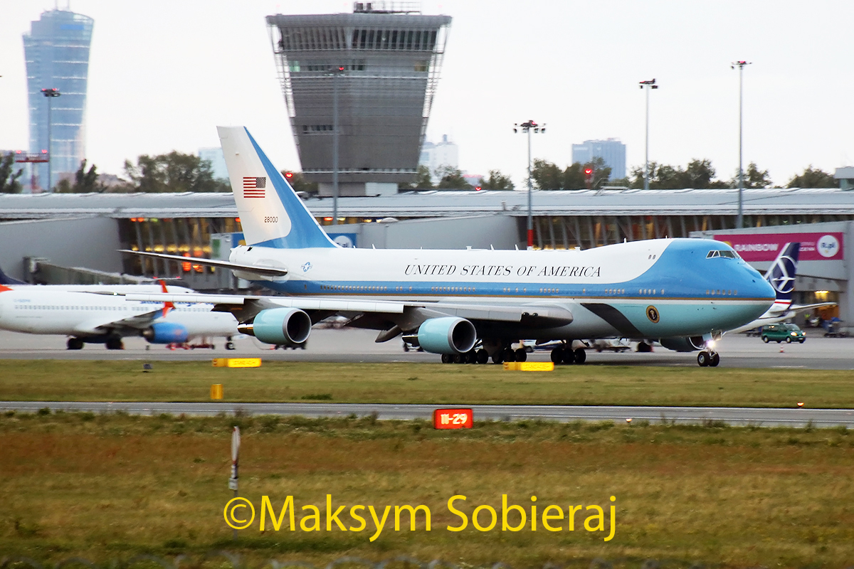
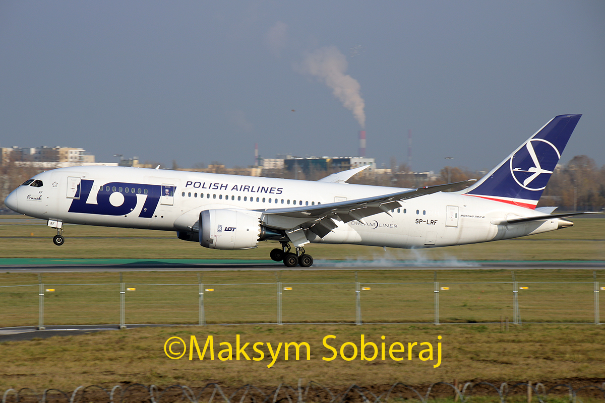
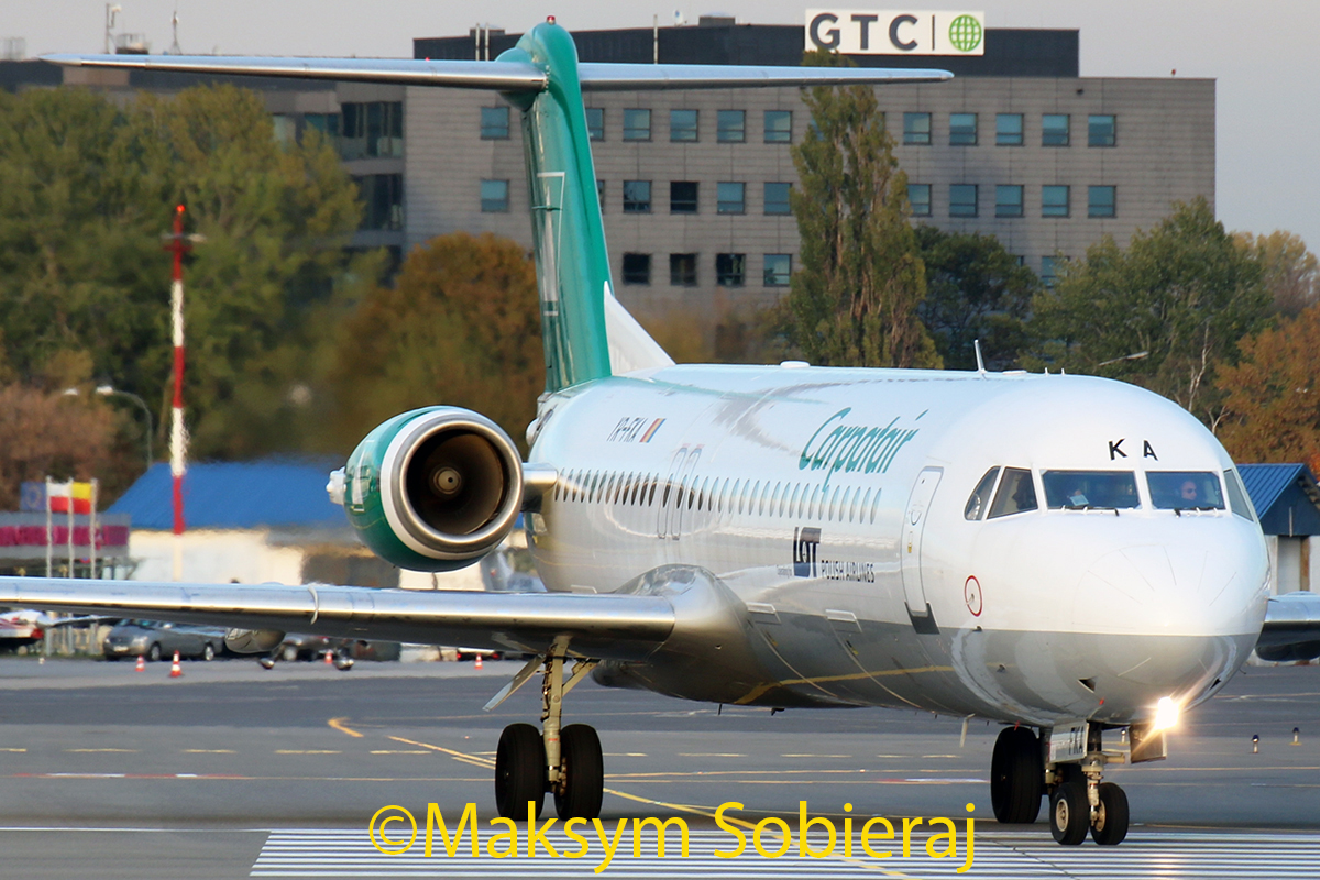
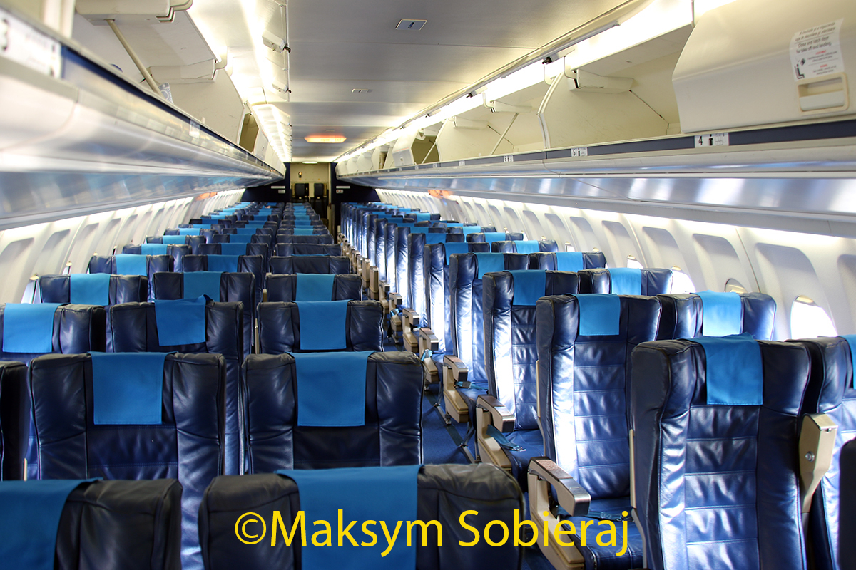
Iskra: Passable-ish.
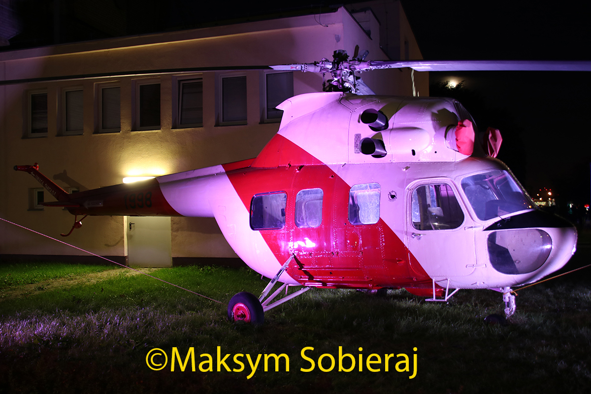
Mi-2: I would personally try to put more green in it, to counter the magenta color. Softish due to blurryish, quality looks 50-50.
AF1: Noisy, oversharpened, distance.
B787: Looks ok, although the crop on the right side is very tight.
F100: Blurry, quality.
Cabin: Blurry, quality.
Re: LotmaniaK photos
Posted: Tue Nov 15, 2016 5:52 pm
by LotmaniaK
Re: LotmaniaK photos
Posted: Wed Nov 16, 2016 5:51 pm
by Kaphias
LotmaniaK wrote:Thanks Kas and spompert. One more:
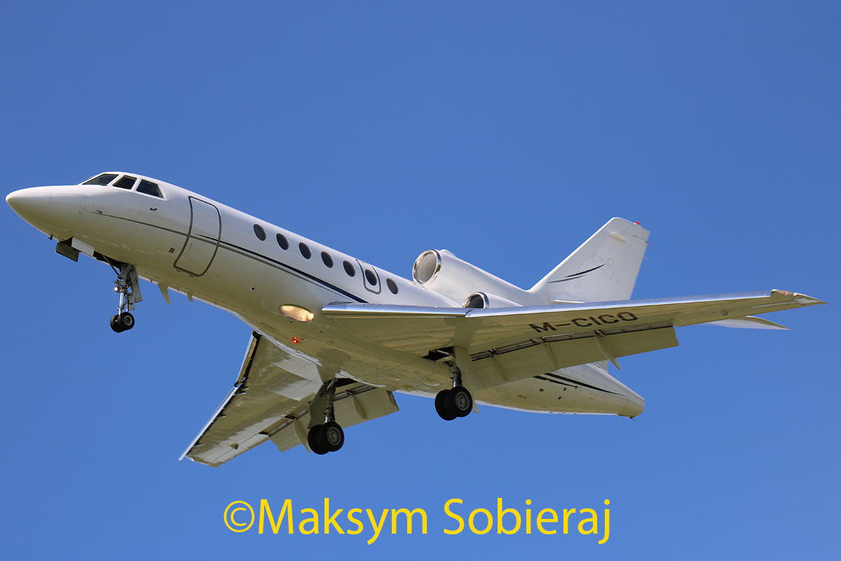
Dassault Falcon 50EX
Very low in frame, also looks soft/blurry but my judgement of that shouldn't be trusted...
Re: LotmaniaK photos
Posted: Wed Nov 16, 2016 10:59 pm
by LotmaniaK
Thanks Kaphias. What about this photo ? Would it be rejected for motive ?
A330
 IMG_5679Maksym1 https://www.flickr.com/photos/143850971@N07/
Re: LotmaniaK photos
Posted: Thu Jan 12, 2017 8:01 pm
by LotmaniaK
Hello, today I got this two photos rejected for:
Oversharpened
http://cdn-www.airliners.net/photos/air ... 94e851135aNoise
http://cdn-www.airliners.net/photos/air ... 90d3a852e6Please tell me If I can improve quality of these photos and give them a second chance, thanks.
Re: LotmaniaK photos
Posted: Fri Jan 13, 2017 3:18 pm
by trevisan26
About the engine shot, try to include the whole landing gear on the right and crop a little more on the left side to avoid the foreground distractions. Looks dark also. Cant comment about sharpness.
TNT shot I can see some grainy on the sky and I would remove the airplane in the background, in some cases you can get a dirty rejection.
Regards
Re: LotmaniaK photos
Posted: Sat Mar 04, 2017 10:04 pm
by LotmaniaK
Re: LotmaniaK photos
Posted: Sun Mar 05, 2017 5:38 am
by len90
ANA Dreamliner: definitely low contrast. Adjusting the contrast may fix that exposure.
Eurowings 320: Same as ANA
LH 321: Maybe appearing soft due to the sun glare line. Not really sure with my display I am on.
Re: LotmaniaK photos
Posted: Mon Mar 06, 2017 8:50 pm
by LotmaniaK
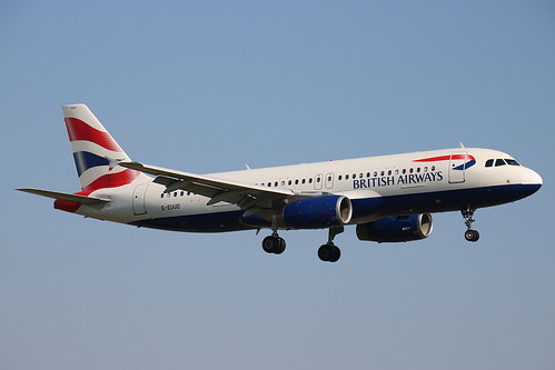
Thanks len90, any opinions about Siberia and British ?
Re: LotmaniaK photos
Posted: Fri Mar 10, 2017 11:17 am
by airkas1
S7: Blurry/soft, quite bright and quality is marginal.
ANA: Low contrast & soft. Disagree on overexposed.
Germanwings: Blurry/soft, low contrast. More contrast might fix the exposure.
LH A321: Blurryish/softish, marginal quality.
BA: Titles look oversharpened.
Re: LotmaniaK photos
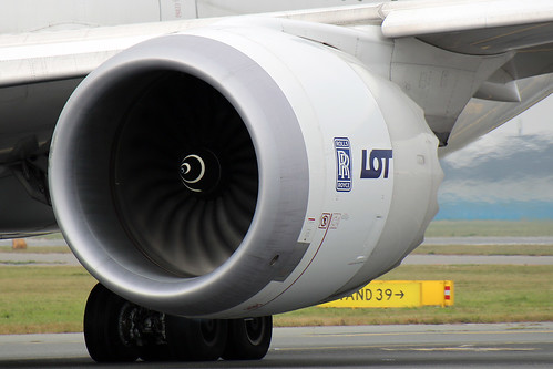
Posted: Wed Apr 05, 2017 7:20 pm
by LotmaniaK
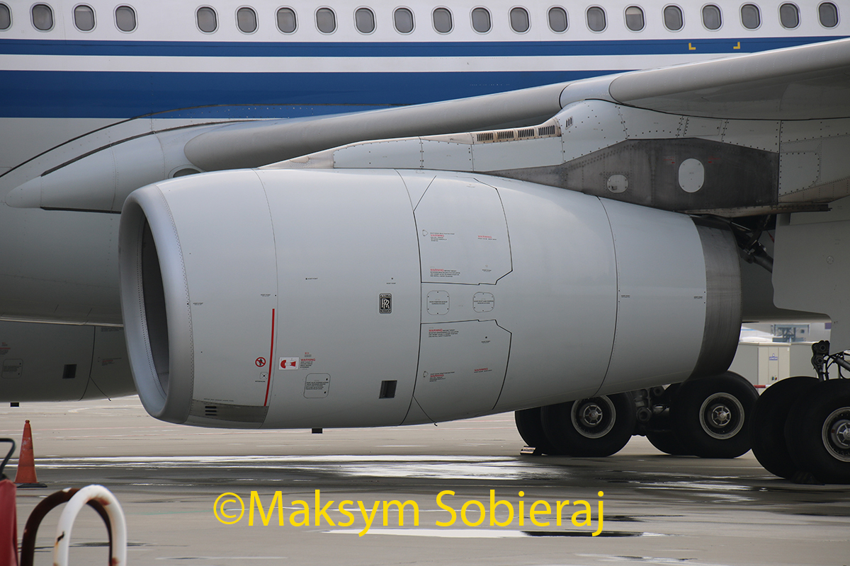
Any opinions about this engine pick ?
Re: LotmaniaK photos
Posted: Thu Apr 06, 2017 3:05 pm
by airkas1
Quality isn't that good, feels left in frame and not that appealing to me personally.
Re: LotmaniaK photos
Posted: Thu Apr 06, 2017 3:21 pm
by HarryLi
Yeah i agree with Kas .. The quality of the whole picture seems not pretty good. Besides, i think the Left side Space is smaller than the right.
Re: LotmaniaK photos
Posted: Thu Apr 06, 2017 11:17 pm
by len90
Definitely agree on the composition right now with the centering. Wonder if the quality is just more of a victim of the lighting conditions at the time of the picture.
Re: LotmaniaK photos
Posted: Sun Apr 09, 2017 1:31 pm
by LotmaniaK
Thank you all for feedback. What about this photo ?
Re: LotmaniaK photos
Posted: Sun Apr 09, 2017 9:11 pm
by spompert
To me it does not look balanced with a lot of space on the left side. Would be better if you include the whole engine and/or wing.
Re: LotmaniaK photos
Posted: Fri Apr 14, 2017 7:37 pm
by LotmaniaK
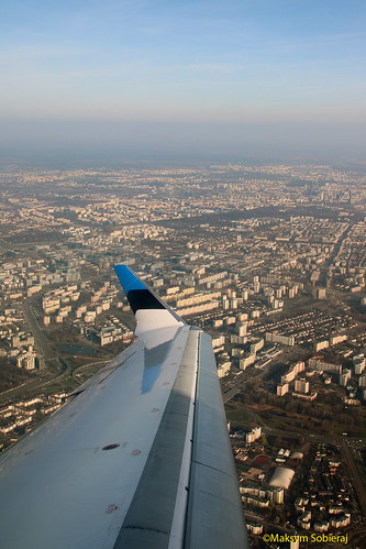
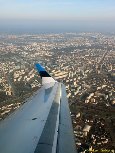
Thanks spompert. What about this wing view ?
Re: LotmaniaK photos
Posted: Sat Apr 15, 2017 10:44 am
by spompert
Hi, I would say the wing is a bit dark and the furthest background is very low in contrast. You might improve by choosing more 2:3 or 3:4 ratio so you can clip some air. Doing this you might be able to improve the contrast of the landscape and brighten the wing a bit more without overexposing other parts of the photo. Better to resize to 1200px. Greets
Re: LotmaniaK photos
Posted: Mon Apr 17, 2017 11:30 am
by airkas1
Wingview 1) Yellow, noisy, small window reflection underneath the engine
Wingview 2) Noisy, better in 3:4 crop to eliminate 'dead' sky. Contrast is ok for me
Re: LotmaniaK photos
Posted: Mon Apr 17, 2017 3:59 pm
by LotmaniaK
Second version
Re: LotmaniaK photos
Posted: Wed Apr 19, 2017 3:08 pm
by LotmaniaK
Re: LotmaniaK photos
Posted: Wed Apr 19, 2017 3:14 pm
by airkas1
Definitely looks blurry, sorry.
Re: LotmaniaK photos
Posted: Wed Apr 19, 2017 7:08 pm
by LotmaniaK
Thanks Kas, and what about second version of Nordica CRJ wing view photo ? Is it better than the first one ?
Re: LotmaniaK photos
Posted: Wed Apr 19, 2017 8:44 pm
by airkas1
Better than the first one yes. In a smaller size than you linked, I think it could be passable. For portrait photos, I usually do 1024px on the long size (1200 if quality is exceptional).
Re: LotmaniaK photos
Posted: Thu Apr 20, 2017 2:24 pm
by LotmaniaK
Two more photos :
Re: LotmaniaK photos
Posted: Thu Apr 20, 2017 4:10 pm
by airkas1
Both are oversharpened and not great quality. Doubtful they will get accepted, sorry.
Re: LotmaniaK photos
Posted: Sat Apr 22, 2017 6:32 am
by LotmaniaK
Re: LotmaniaK photos
Posted: Sat Apr 22, 2017 7:08 am
by HarryLi
LotmaniaK wrote:
Both of them i think can be fixable.
Re: LotmaniaK photos
Posted: Sat Apr 22, 2017 8:02 am
by LotmaniaK
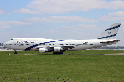
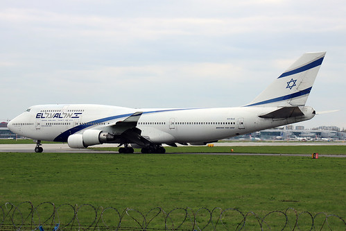
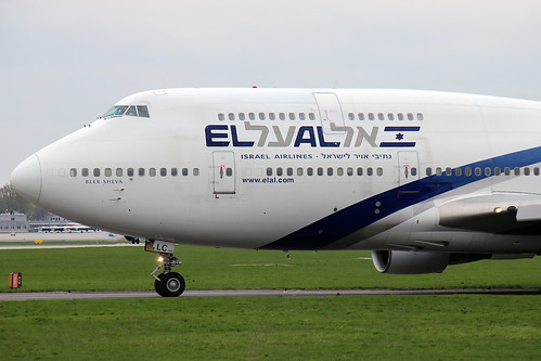
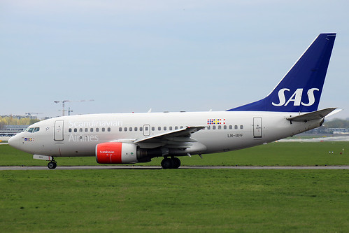
2 more photos :
Re: LotmaniaK photos
Posted: Sat Apr 22, 2017 3:33 pm
by LotmaniaK
One more :
Re: LotmaniaK photos
Posted: Mon Apr 24, 2017 10:27 am
by airkas1
EK: should be fixable
ANA: looks a bit blurry. Don't think it's fixable by adding more sharpening.
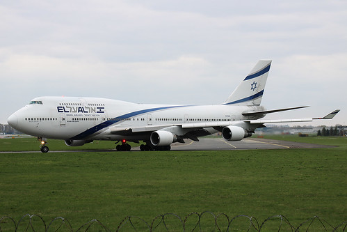
El Al: blurry, oversharpened, quality.
SAS: oversharpened, quality.
El Al: blurry, oversharpened, quality.
Re: LotmaniaK photos
Posted: Wed Apr 26, 2017 9:51 am
by LotmaniaK
Re: LotmaniaK photos
Posted: Wed Apr 26, 2017 11:13 am
by HarryLi
The first one seems grainy.
The second one and the final one i guess a little bit OS.
A321 is better than others but still OS i think.
Re: LotmaniaK photos
Posted: Thu Apr 27, 2017 8:35 am
by LotmaniaK
Re: LotmaniaK photos
Posted: Thu Apr 27, 2017 1:27 pm
by HarryLi
The first one i think is ok.
The second one looks a little fine.
The third one is ok for me.
Forth: Ok for me.
KLM : Ok for me.
The final one, i think a little bit OS i think. Especially the wing has a little jaggy i guess.
And i recommend that you use another compressing way.If you use PS when you change the size , the ps will auto choose Auto Mode, but i usually choose another one i don't know what is the name in your version because i use Chinese Version i remember it should be the second one in the list.I think that way can improve Picture Quality.
Cheers,
Harry
Re: LotmaniaK photos
Posted: Fri Apr 28, 2017 9:21 am
by LotmaniaK
Re: LotmaniaK photos
Posted: Fri Apr 28, 2017 1:13 pm
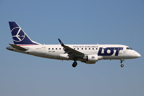
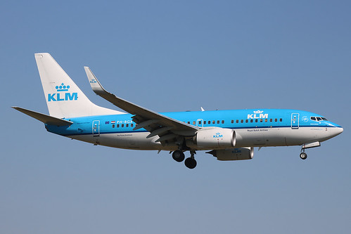
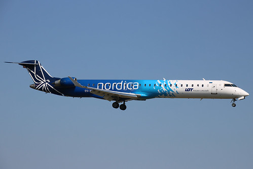
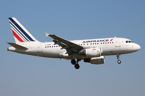
by airkas1
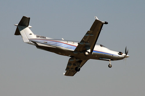
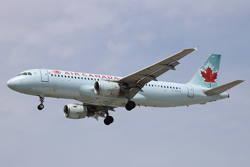
PC12: marginal quality, doubt it will get in.
The AC's are a bit marginal, could go either way. They seem to be a sort of mix of slight noise/blurry/oversharpened.
BA: oversharpened
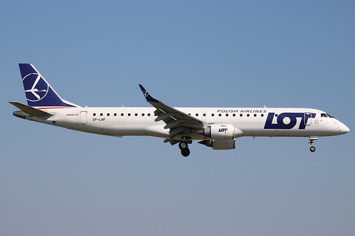
LO: oversharpened
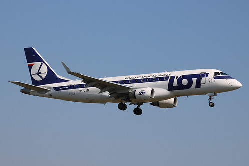
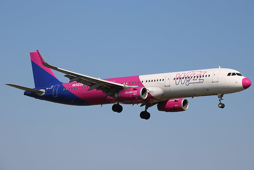
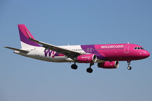
W6: oversharpened
LO: marginal
KL: marginal
Nordica: sharpish at the titles, somewhat marginal
AF: passable
LO: bit oversharpened
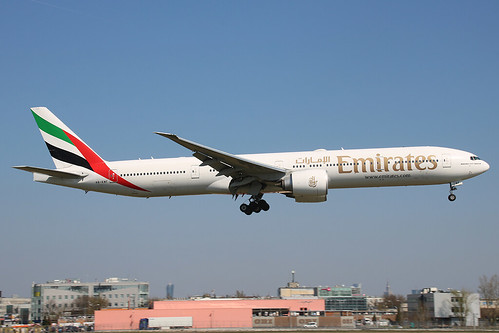
EK: oversharpened
W6: not great, but maybe passable
 https://flic.kr/p/N3jhFShttps://www.flickr.com/photos/143850971@N07/
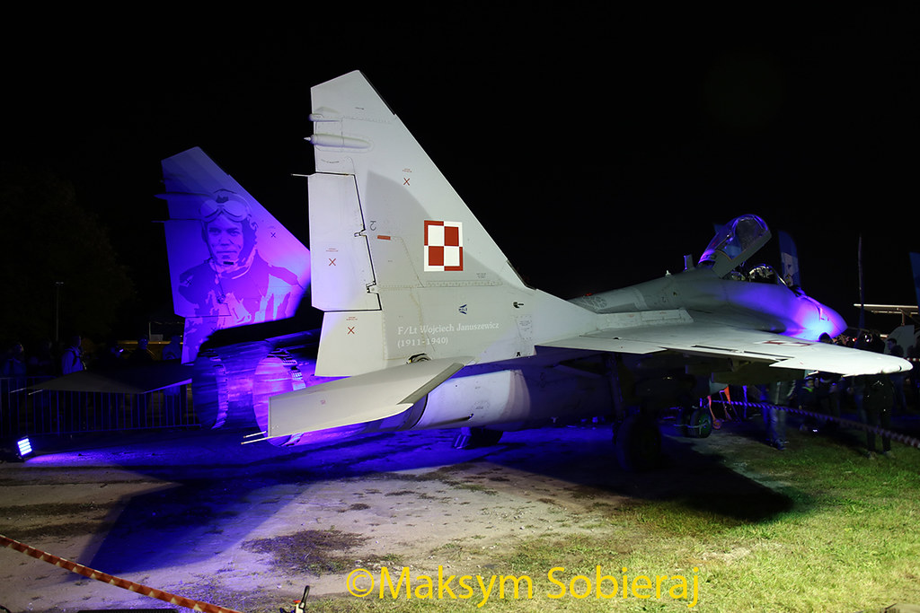 https://flic.kr/p/N3jhqwhttps://www.flickr.com/photos/143850971@N07/
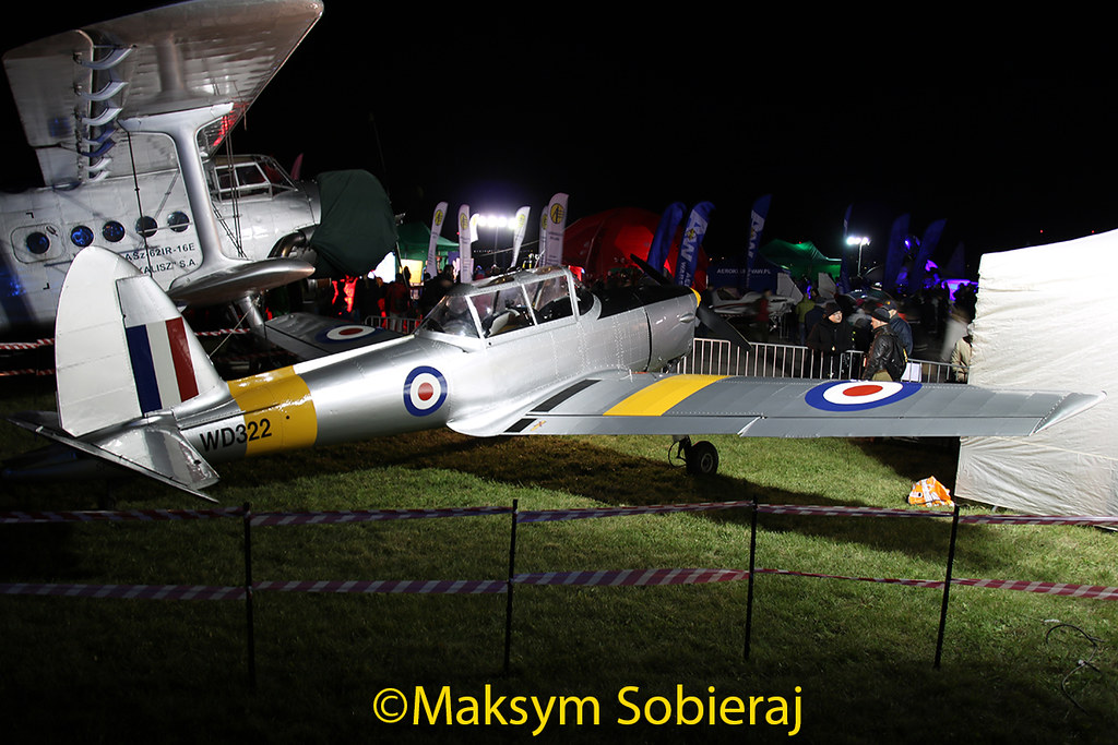 https://flic.kr/p/N3jhamhttps://www.flickr.com/photos/143850971@N07/
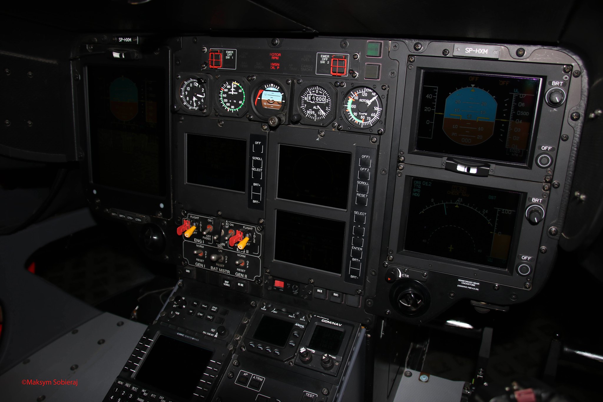 https://flic.kr/p/NdxTGahttps://www.flickr.com/photos/143850971@N07/
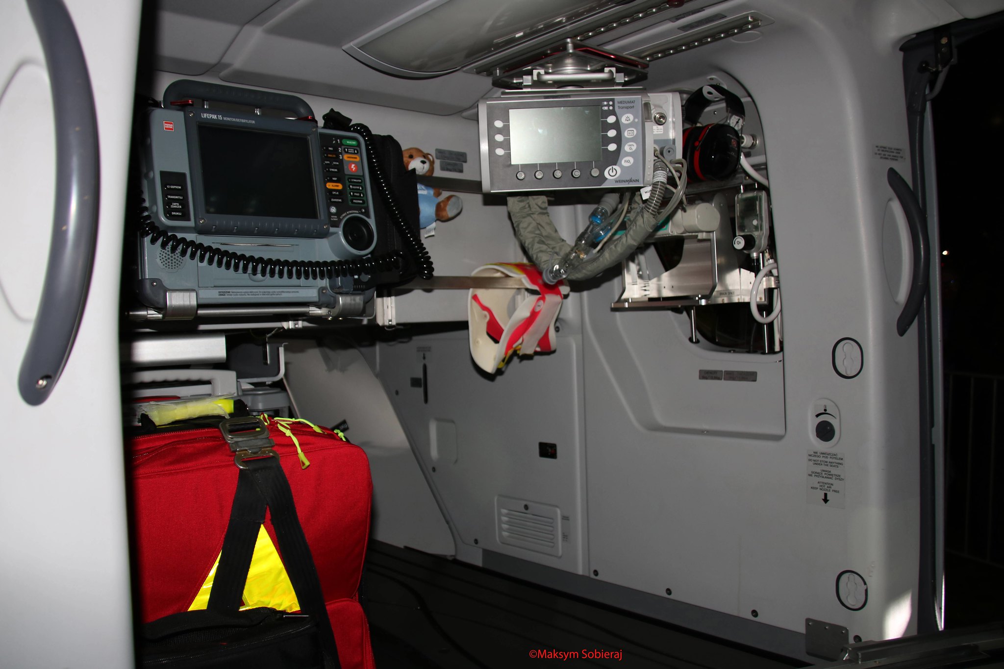 https://flic.kr/p/N3jgQJhttps://www.flickr.com/photos/143850971@N07/
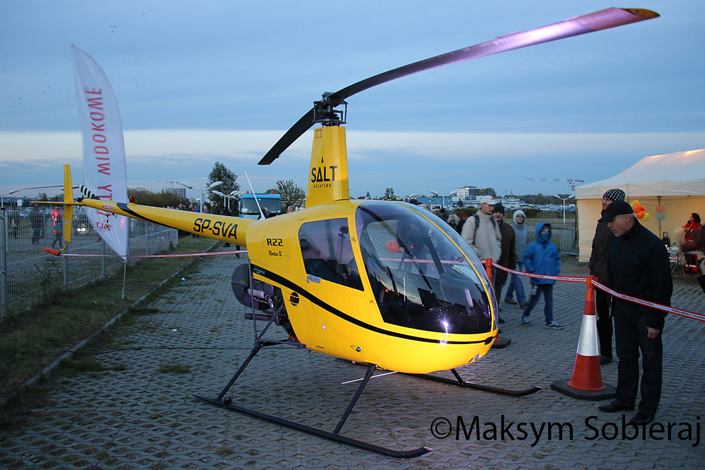 https://flic.kr/p/N3jepmhttps://www.flickr.com/photos/143850971@N07/